As online college courses continue to grow in popularity, it’s important to ensure that they are accessible and inclusive for all students. One way to achieve this is by using Universal Design for Learning (UDL) when creating an online course. UDL is an educational framework that provides students with multiple means of accessing the course and benefits people of all learning styles without adaptation or retrofitting. In this blog post, we’ll explore the importance of using UDL when creating an online college course and provide citations for academic research articles that support its implementation.
II. What is Universal Design for Learning?
Universal Design for Learning (UDL) is an educational framework that provides students with multiple means of accessing the course and benefits people of all learning styles without adaptation or retrofitting. UDL is based on three overarching principles: presentation, action and expression, and engagement and interaction.
The first principle, presentation, involves providing learners with various ways of acquiring information and knowledge. This can include using different formats such as text, audio, and video to present information.
The second principle, action and expression, provides students with various routes for demonstrating what they know. This can include allowing students to complete assignments in different formats such as written essays, oral presentations, or multimedia projects.
The third principle, engagement and interaction, enables an instructor to tap into students’ interests, challenge them appropriately, and motivate them to learn. This can include using interactive activities and group work to engage students in the learning process.
By incorporating these three principles into the design of an online college course, instructors can create a more inclusive and accessible learning environment for all students.
III. The Importance of UDL in Online College Courses
Incorporating Universal Design for Learning (UDL) into the design of an online college course is important because it provides students with multiple means of accessing the course and benefits people of all learning styles without adaptation or retrofitting. This means that students with different learning needs and preferences can access the course materials and participate in the course activities in a way that works best for them.
By using UDL principles when designing an online college course, instructors can create a more inclusive and accessible learning environment for all students. This can help to reduce barriers to learning and increase student engagement and success.
In addition to benefiting students, using UDL principles when designing an online college course can also benefit instructors. By providing multiple means of accessing the course and allowing students to demonstrate their knowledge in different ways, instructors can gain a better understanding of their students’ learning needs and preferences. This can help instructors to tailor their teaching approaches to better meet the needs of their students.
Overall, incorporating UDL into the design of an online college course is an important step towards creating a more inclusive and accessible learning environment for all students.
IV. Research Supporting UDL in Online College Courses
There is a growing body of academic research that supports the use of Universal Design for Learning (UDL) in online college courses. Here are three research articles that provide evidence for the effectiveness of UDL in online college courses:
1. Dell, C.A., Dell, T.F., & Blackwell, T.L. (2015). Applying Universal Design for Learning in Online Courses: Pedagogical and Practical Considerations. This article discusses the inclusion of the UDL model as a guiding set of principles for online curriculum development in higher education .
2. Gravel, J.W. (2023). Universal Design for Learning: Explore. This workshop offered by Harvard Graduate School of Education provides participants with a deeper understanding of UDL and how it can be applied across various learning environments .
3. Center for the Advancement of Teaching Excellence (n.d.). Universal Design for Learning (UDL). This resource from the University of Illinois at Chicago provides an overview of UDL and its importance in creating learning environments that address the diverse needs of learners .
These research articles provide evidence for the effectiveness of using UDL principles when designing online college courses. By incorporating UDL into their course design, instructors can create a more inclusive and accessible learning environment for all students.
V. Conclusion
In conclusion, incorporating Universal Design for Learning (UDL) into the design of an online college course is an important step towards creating a more inclusive and accessible learning environment for all students. By using UDL principles when designing an online course, instructors can provide students with multiple means of accessing the course and allow them to demonstrate their knowledge in different ways. This can help to reduce barriers to learning and increase student engagement and success. With a growing body of academic research supporting the use of UDL in online college courses, it’s clear that UDL is an effective approach to creating inclusive and accessible online learning environments.
Post #12 (of 12) in the series of posts about improving the accessibility of online courses.
In previous posts we examined many of the accessibility tips for making online course content using HTML pages, Microsoft® Word documents, and Microsoft® PowerPoint® documents. In this final installment, we’ll look at a few final suggestions for making a positive impact on the accessibility of online courses.
1. Try out Assistive Technology for yourself
A screen reader is a computer program that produces an auditory version of the text that is available on a webpage, or a computer-generated document. Commonly used screen readers are JAWS®, NVDA, Windows Narrator, and VoiceOver for Mac. You are able to try all of these programs for free, and I suggest you do so in order to get a feel for that user experience. Only JAWS requires a paid license for continued use. There is a bit of a learning curve when getting started with a screen reader, but as you stumble through your first couple of times using a reader, you’ll likely develop some empathy for students who must rely on such technology for their access to learning. You can find more about these platforms here:
2. Know when to use PDF as your document file type
PDF can be a good choice for document file type, if:
The document appearance is critical and must look exactly the same across various different computing platforms.
The document needs to be encrypted, will include things such as a watermark or a digital signature.
You want to make it more difficult for the viewer to edit the document.
Keep in mind however, that for delivering content on a web page, such as in an online course, a properly made HTML page will be the most accessible file format.
3. Learn about making PDF documents accessible to students using Assistive Technology
If you’ve decided that an accessible PDF is the way you need to go, then you need to know how to properly create the document.
There are two ways to create an accessible PDF, either a) converting a source file, like a PowerPoint®or a Word document to a PDF or b) scanning a hard copy of a document to PDF.
4. Go another step beyond captioning, use described videos
Captioned videos are a good first step toward accessibility of video content for online courses, however, the captions tend to capture the words spoken in the video, which can sometimes be confusing without understanding the context within which they are being spoken.
Described video, descriptive video, and audio description are three terms that all mean the same thing, a voiceover description of the primary visual elements in a video. Some examples of things that could be described on a video include setting the scene, costumes, actions, expressions, scene changes, and the like. These descriptions would be beneficial to viewers with low or no vision, as long as they can hear the audio descriptions.
There are many factors to consider when making described videos, and the full extent of knowledge extends beyond this series of accessibility tips for online courses. However, one free and simple service to consider is the website YouDescribe.org, where you can add audio descriptions to YouTube™videos. Embedded below is an example of a described video from that site.
5. Test your webpages using only your keyboard
Open one of your course content pages in a new window. Using only your keyboard (hands off the mouse!), can you access all the features and operate all the buttons or links using keys on the keyboard?
If it is a simple webpage with text and images, I’ll guess that your answer is yes. However, if you have embedded videos, an audio player, or action buttons there’s a chance that you’ll find the keyboard-only access is not sufficient. If that is the case, you may need to change that content, or get some technical help to make the content more accessible.
Keyboard users typically use the Tab key to navigate through the various components of a webpage. The other most commonly used keys are Enter, Spacebar, and the Arrow keys.
6. Be familiar with the applicable laws, and some of the lawsuits against educational institutions
There is a great deal of information available on the Internet about the accessibility laws, and resulting lawsuits that have impacted educational institutions. It is in the interests of all educators to become familiar with the legal expectations and ramifications related to accessible educational offerings.
Post #11 of 12 in the series of posts about improving the accessibility of online courses.
Let’s say that you’re doing everything right. You’ve improved the accessibility of your HTML course content pages, your Word docs, your PPT files. You’ve ensured that you’re using course videos with good captions and that all your images have useful and accurate alternative text. Everything in your online courses can pass a web accessibility test…right?
And then you decide to add a new assignment and have your students create a learning artifact using the hottest free web-based tool that’s all the rage in your social media. And boom, your fabulous accessibility goes down the tubes. Why? Because many (actually most) of these web-based tools have serious accessibility issues.
Mea Culpa
Let me start with an apology. For years I made conference presentations that basically encouraged the problems that I’m trying to address in this post. My most popular presentations from 2004 to 2012 were about using free tools in your online courses. I mostly ignored the many issues related to web accessibility with these tools. In my defense, most other people also ignored these issues. My motto was, have embed code, will travel. If I could build something (or have students do it) and if there was an easy embed code for me to post it into an online course – then I said “DO IT!”
embed a web object into an online course for your student to use
communicate with students using an external tool
Then you must ensure that these items are accessible to students using Assistive Technologies (AT). Very many of them are not accessible. An example: you create an animated comic strip that is a clever representation of a particular learning outcome that your students need to master. Sadly, anyone using a screen reader cannot navigate through the animation to learn the relevant content. Doesn’t matter how clever it is if it’s inaccessible.
Accessibility Issue #2
If you are having students use web-based tools to create class-related work:
are the web-based creation tools accessible to them if they use AT?
if they are able to create an object, are they able to take it and communicate it to you in an accessible manner?
are you prepared to give alternate assignments that allows them to use AT, if needed?
To clarify, you decide to have students use a web-based tool to create an online presentation, or a video, or some other artifact that represents their learning on a topic. You decide that they should all use Prezi to create a presentation instead of writing a term paper. Writing a term paper is highly accessible, but creating a Prezi is not accessible at all. I wrote about the accessibility of Prezi in a previous post.
Accessibility Issue #3
This one is all about you. If you, as instructor or designer, rely on assistive technology (AT) to do your work, will these sites work with your needed AT? If you rely on a screen reader and keyboard-only controls, then you also won’t be able to create a Prezi for your students to learn from. There are many other free sites that you also won’t be able to use if you rely on AT to get your work done.
How to Deal with Inaccessible Web-based Tools
Should we put a moratorium on using any tools that don’t pass muster with #a11y? Is this an absolute Stop Sign saying that we should not use them at all?
While still keeping an eye on making accessible online courses, I’ll argue that a complete moratorium is not what is needed. So, instead, let me propose something more like the next sign…
Saying YES to accessibility does not always mean saying NO to inaccessible items in your course. There is power in alternative methods and alternative assignments.
Providing Flexibility Through Alternatives
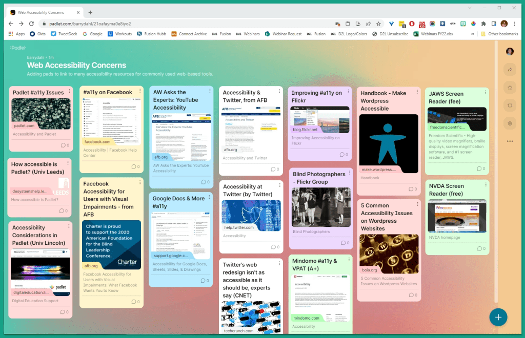
Hypothetically speaking, let’s say that you’ve fallen in love (not literally) with Padlet. You want to create an assignment for your students to each “add a pad” to a Padlet to share their thoughts, or website URLs, or photos, or videos, or whatever. Sounds great, right?
However, you have one or more students who need to use keyboard navigation as their only way to access a website. First, for the initiated, a little primer from WebAIM:
Keyboard accessibility is one of the most important aspects of web accessibility. Many users with motor disabilities rely on a keyboard. Some people have tremors which don’t allow for fine muscle control. Others have little or no use of their hands, or no hands at all. In addition to traditional keyboards, some users may use modified keyboards or other hardware that mimics the functionality of a keyboard. Blind users also typically use a keyboard for navigation. Users without disabilities may use a keyboard for navigation because of preference or efficiency.
Here’s what Padlet says about keyboard-only navigation: “Currently, you can navigate the login page and the dashboard using only your keyboard. Padlets can be viewed, but settings cannot be changed. We are working on keyboard compatibility for settings, post creation, post editing, and post expansion.”
So, you can “view” a Padlet (which means a screen reading platform can read the Padlet text out loud to you) but you cannot post a Padlet of your own using the keyboard (so, mouse required). That’s a problem for you assignment of having students post Pads to a Padlet.
As I said previously, I don’t think this means that YOU CANNOT use Padlet, and I suggest that you ponder the answer to these questions as you make this assignment:
Can you imagine another way that the keyboard-only student could arrange to have their thoughts posted to a pad? In other words, what’s the work-around?
Can you imagine an alternate assignment for the students unable to use Padlet?
Can you imagine a totally different assignment (for everyone) that will still meet your learning outcomes but without using inaccessible technology?
Can you keep the same assignment but find an accessible tool that you could use instead of Padlet?
There are definitely more questions to ponder here, feel free to add your own.
Before I leave Padlet in the dust (in this post anyway), let me share the following Padlet with you. Yes, I know it’s a bit ironic, but as Padlet says, readers using Assistive Technology can at least view a Padlet, so here goes.
A Padlet about accessibility concerns of some popular web-based tools
The Padlet shown above is a collection of several links to resources detailing some of the accessibility concerns and/or features of commonly used web-based tools. By visiting this site you might find some links that are of interest to you, and you’ll also be able to experience a Padlet first-hand to consider any #a11y issues that might be apparent to you.
Some Other Web-based Tools Commonly Used in Education
Prezi – the PowerPoint Killer
I previously wrote about the accessibility abomination that is Prezi. Much of what I wrote is still true, but they are finally starting to make some improvements in their total lack of #a11y conformance (and I do mean …….at very long last). They recently published their first VPATs, one for their Video View page, one for their Design View page, and a third VPAT for Video Quick Record (these are all PDFs).
Although Prezi’s #a11y information page is better than nothing, it is still pretty close to nothing. For example, under the heading of “How to create accessible content with Prezi” they say the following: “Be more inclusive by planning for viewers with disabilities while creating your presentation, video, or design. These articles will help you in creating content that is easier to follow for audiences with permanent or temporary disabilities. Please note that this section is in progress, with more articles to come.” As of this writing on 9/8/22, there are ZERO articles in this section.
The heading for this section is intended as a joke. Many people were calling Prezi the PowerPoint killer when it was first introduced. People were fascinating by the non-linear possibilities of a Prezi presentation. Less fascinating is the almost complete lack of web accessibility features of the tool. Since PPT presentations can be made highly accessible, it’s a wonder to me that Prezi gets used at all.
Below you see a screenshot of an embedded Prezi in Brightspace. Think twice before using Prezi for your course content. Going back to the yield sign above, you could use Prezi if you feel that you must, but then you also MUST provide all the same learning content in an accessible format.
VoiceThread for Threaded Audio Discussions
Not all web-based tools have a horrible track record for accessibility. But even those that are working to improve their web accessibility still usually have some issues that they haven’t conquered yet. VoiceThread is a good example.
Voicethread is increasingly being used in education at all levels. Some of their features (from their website) include:
Creating: Upload, share and discuss documents, presentations, images, audio files and videos. Over 50 different types of media can be used in a VoiceThread.
Commenting: Comment on VoiceThread slides using one of five powerful commenting options: microphone, webcam, text, phone, and audio-file upload.
Sharing: Keep a VoiceThread private, share it with specific people, or open it up to the entire world.
Although better than many other free web-based tools, VoiceThread does still have a few accessibility issues to be aware of.
Voicethread provides for both audio and text comments. It is one of the most accessible Web 2.0 platforms that you will find.
You can learn more about both the good and the not-so-good in theseresources:
One tool that I frequently have recommended over the years and used myself is Slideshare, which is now part of LinkedIn.
For a long time there were inherent problems with using PowerPoint slide decks on the web. Sure there were various ways to do it, but none of them were great. That’s not quite true, because there were some great tools, but they weren’t free; which was another aspect of the tools that I shared in my presentations. They needed to be free, and easy to use. Web accessibility was not one of my criteria, but it is now.
When Slideshare came on the scene, I became an early user and started including it in my presentations about using Web-based tools inside the LMS. Here, for example, is an embed of one of my old slide decks (use your imagination and envision this embedded into an online course, instead of this blog)
You can view the Slideshare transcript(opens in new window) at their site, but these slides were not constructed to be accessible. Thus, the transcript is not very useful to the unsighted user. There is a great deal of information in the slides that they would not have access to.
The easy to find, easy to use embed code was one of the reasons why I liked Slideshare. Webbifying the otherwise bulky, clumsy PPT slides was so much better than trying to get native slides to play nicely in the browser. But what about accessibility, you ask?
You can make PPT slides that conform to most of the a11y standards (or good practices, if you prefer). Wouldn’t it be great if your accessible PPT slides could be uploaded into Slideshare and still be accessible? Sure, that would be great. Sadly, that’s not how it works. At least, it won’t work that way without you planning ahead to make it so and then jumping through a couple of extra hoops.
There are quite a few a11y issues with using Slideshare. You can read much more about using SlideShare inside the LMS in one of my earlier blog posts.
I’m going to stop here, but there are hundreds (thousands?) of web-based tools out there that you might be tempted to use. I encourage you to do a fair amount of research on these tools regarding their accessibility features. You’ll likely find that most of them have very serious issues and present high hurdles for you and your students to overcome.
Blog Post #10 in Series of Accessibility Tips for Online Teaching. Only two more coming!
Microsoft® PowerPoint® presentation graphics program and similar programs are frequently used for creating course content in all levels of education. If those PowerPoint® slide decks are placed online as part of an online course, it is important for those decks to be accessible to student using assistive technology.
Using PowerPoint Slides in Online Courses
First, an opinion regarding slide shows as course content. From an accessibility perspective, the same content provided in an HTML page or a series of pages would usually be more accessible than a slide deck. Whenever possible, provide online course content as a web page. If that is not possible, then providing a slide deck that is created in an accessible manner is one alternative to consider.
There is a complicating factor when designing a slide deck for students using a screen reader. There are different views that the student can utilize when screen reading through a PowerPoint file. The Normal View in PowerPoint presentation manager is most often used by sighted users, and can be used with a screen reader. However, many unsighted users will switch to the Outline View which provides a text-only reading of the slide contents. It is a good practice to design your content in Outline View to ensure that all important information is available to students using a screen reader with this view. When the Outline contains all necessary information, you can switch to Normal View to add additional elements for sighted users.
Accessibility Tips and Techniques When Using PowerPoint
In this post, we’ll consider the following items:
Proper use of layout templates
Proper use of slide titles
Reading order of multiple elements in a slide
Similarities to accessibility in Microsoft® Word®
Using the built-in Accessibility Checker
Proper use of layout templates
Since 2000, PowerPoint presentation graphics program has included a selection of highly-accessible slide layouts. By utilizing these layout options, you will have an easier time making your slide content accessible to students using assistive technology such as screen reader platforms. Every time that you add an additional element to a slide that isn’t contained in one of the built-in placeholders, you run the risk of that piece of content being inaccessible.
When adding a new slide, choose the slide layout that contains the type of content elements that will best fit your needs. You can also change the current layout of any existing slide by selecting your choice from the Home > Layout menu.
You can resize and move the slide elements without negatively impacting the accessibility of the slide. However, let’s look at an example of what happens when you add new elements to a slide.
Let’s assume that you choose a new slide from the graphic shown above, and that you choose the “Title Only” layout. You enter a title for the slide. You then select Insert > Pictures and you add a photograph to the slide. You then select Insert > Text Box and write a caption for the photograph. You size and position both the photo and the caption so it looks good to the sighted student. However, to the unsighted student using a screen reader in Outline View, they will hear the slide title, and that’s all. Neither the added text box nor the inserted photo will appear in the Outline View of the slide.
Proper use of Slide Titles
Until you design a slide deck with accessibility in mind, you probably haven’t given much thought to your slide titles, at least not much thought to their importance to a student using a screen reader.
Each slide should have a descriptive title that helps organize the content for the unsighted user. Including a slide that does not have a title leaves a blank space in the Outline View, which is confusing to someone using a screen reader. Even if you don’t want to have the slide title appear on the slide for sighted viewers, you should still populate the title placeholder, and then hide the title behind another object, or by moving it off-screen (it’s still part of the slide, just not in the viewing area), or by using the Hide feature found in Home > Arrange > Selection Pane.
The titles should also be unique. Repeating the same title text would be similar to having two chapters in a book with the same title. Having unique titles enables people to navigate quickly, especially when attempting to return to an earlier slide for review.
The example above indicates what it would be like for an unsighted student to use a screen reader while tabbing through the titles of slides. Slide 2 has no title at all, and slides 4 and 5 have the same title.
Reading order of multiple elements in a slide
This one is often overlooked by people creating PowerPoint slides, unless they have an eye on accessibility. Previously we looked at the importance of using the built-in slide layouts with accessible placeholders for titles, text, pictures, etc. Now let’s look at what difference it makes when those multiple slide elements are being read to a student by a screen reader. In the accompanying graphic, there are five elements on the slide: 1) title, 2) left text placeholder, 3) left content, 4) right text placeholder, 5) right content.
Most of the time, you would want a screen reading program to read those five elements in the order listed above. The newer versions of PowerPoint presentation graphics program are better at determining a logical reading order for the elements on a slide, but older versions are trickier. The graphic below shows the order that the elements would be read by a screen reader. Notice that the Home > Arrange> Selection Panel will list the slide elements from the bottom up. In this example, the elements would be read to the student in the proper order.
However, in older versions of PowerPoint, the elements would be read in the order in which you entered them into the boxes. For example, the reading order could be as shown below by the black boxes:
In this case, you would need to drag and drop the elements in the Selection pane to put them in the proper reading order, again with the first item at the bottom of the list and the last item at the top. This is counter-intuitive to many people.
Similarities to accessibility in Microsoft Word
In the previous post, we looked at various accessibility features in Microsoft Word. There are many similarities between Word and PowerPoint programs when it comes to accessibility for students using assistive technology. Please refer back to the previous post for information about the following items:
Where to add Alt Text
Formatting of tables
Using the Built-in Accessibility Checker
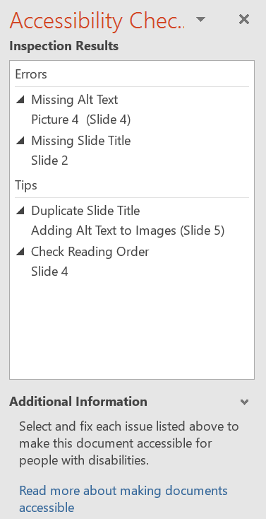
Starting with PowerPoint 2010 presentation graphics program, there is a built-in tool that checks your document for accessibility problems. The Accessibility Checker makes it much easier to identify and repair accessibility issues. To use the tool, select File > Info > Check for Issues > Check Accessibility.
An example report is shown on the right. Click on any of the reported items to get help with improving the accessibility of the various slides.
Categories of items found by Accessibility Checker
Errors: Content that makes the document impossible or very difficult to read and understand for people using assistive technology. Common errors in PowerPoint documents include:
Slides without titles
Missing alt text for non-text objects
Proper table header formatting
Warnings: Content that will likely (but not always) make the document difficult to understand for people using assistive technology. Common warnings include:
Table structure (split or merged cells, nested tables, or completely blank rows or columns)
Hyperlink text that is not meaningful or descriptive
Tips: Content that should be understood with assistive technology, but could be better organized to improve the experience. Common tips include:
If there is a video, it will alert you to check for closed captions
Slide titles should be unique (not repeated)
The reading order of various slide components is in logical order
One more thing. If you’re designing slides for accessibility, you’ll need to make the file available to students so that they can use the file with their screen reading platform. If you put the slides online, there is a good chance that many of the accessibility features will be lost. Make the file available for download for those who need to use a screen reader.
In the next post, we’ll conclude this series with six more tips to improve the accessibility of your online course content.
Much of the content in this series of posts comes from WAMOE, the Web Accessibility MOOC for Online Educators; co-created by Karen Sorensen of Portland Community College and Barry Dahl of D2L.
Microsoft and PowerPoint are either registered trademarks or trademarks of Microsoft Corporation in the United States and/or other countries.
Ninth post in Accessibility series. Improving the accessibility of Online Course Content pages. #A11Y
Many educators use one or more programs contained in Microsoft® Office when creating course content or other instructional materials for online courses. In this post we’ll focus on a few tips and techniques for making accessible content using Microsoft® Word, although similar concepts would apply to other word processing programs.
Using Word Documents in Online Courses
First, an opinion regarding word processing documents. From an accessibility perspective, the same content provided in an HTML page would usually be more accessible than a word processing document. If at all possible, provide online course content as a web page. If that is not possible, then providing a Word document that is created in an accessible manner is one alternative to consider.
Accessibility Tips and Techniques When Using Word
In this post, we’ll consider the following items:
Proper use of Word Headings
Where to add Alt Text
Formatting of tables
Using the built-in Accessibility Checker
Proper Use of Word Headings
Proper uses of the heading structure help people with low or no vision to understand how a document is organized. Screen reader users can jump from one heading to the next, which makes page navigation more efficient than if there are no headings. The concept of using proper headings in a Word document is the same as previously covered when creating HTML pages.
You should always use the built-in Styles to identify Heading 1, Heading 2, etc. in a Word document. Simply changing the font size or making it bold does not make it a heading.
The default style in Word uses light blue heading colors. These headings do not have the necessary color contrast for accessibility. Make sure to change those headings to a darker color. You can also edit the default template so that all new documents also have the preferred darker headings.
Where to add Alt Text in Word
If you’ve learned how to add Alt Text to an image in an HTML page, you need to follow a slightly different procedure when adding Alt Text to a Word document. Alt Text should be added to the Description field in the Format Picture box, and the Title field should be left blank. Below is an example of a photo in a Word document on the left and the Format Picture box on the right.
Additionally, when using Word, you should also add Alt Text to the following:
Tables
Charts
WordArt
Shapes
SmartArt graphics
Here is an example using SmartArt. This is the feedback cycle for learning. Start at the top with Understanding & Meaning, and proceed clockwise. As with the photo above, Alt Text goes in the Description field.
Formatting of Tables
There are significant issues for screen reader users when trying to learn from a data table in Word. You are able to add column headers in Word, but it does not support the concept of row headers, which can be problematic for screen reader users.
Steps to follow when designating the header row depend somewhat on the version of Word that you are utilizing. The screenshot below is taken from Word 2016.
Put your cursor in the top row of your data table.
The Table Tools tab will display.
Click on the Design tab under the Table tab.
In the Table Style Options group, select the Header Row check box.
Next, change to the Table Layout tab, as shown below, and click the button “Repeat as Header Rows,” which provides structure for navigating the table if it appears on multiple pages.
Perform one final test on your table before sending it out into the wild. Screen reading software will read tables from left to right, top to bottom, one cell at a time with no repeats. The order in which the cells will be read can be thrown off if your table contains split cells or merged cells.
Always test the reading order of Word tables by placing your cursor in the first cell of the table, then continuously pressing the Tab key to navigate through the table. Pay attention to the order in which the cursor moves through the cells, as this will be the reading order that a screen reader would follow.
Using the Built-in Accessibility Checker
Starting with Word 2010, there is a built-in tool that checks your document for accessibility problems. The Accessibility Checker makes it much easier to identify and repair accessibility issues. To use the tool, select File > Info > Check for Issues > Check Accessibility.
Categories of items found by Accessibility Checker
Errors: Content that makes the document impossible or very difficult to read and understand for people using assistive technology. Common errors in Word documents include:
No headings applied and no Table of Contents used
Missing Alt Text for non-text objects
Proper table header formatting
Warnings: Content that will likely (but not always) make the document difficult to understand for people using assistive technology. Common warnings include:
Table structure (split or merged cells, nested tables, or completely blank rows or columns)
Hyperlink text that is not meaningful or descriptive
Repeated blank characters
Tips: Content that should be understood with assistive technology, but could be better organized to improve the experience. Common tips include:
If there is a video, it will alert you to check for closed captions
If an image has a watermark, it might be misunderstood
Headings follow in a logical order, no levels are skipped
In the next post, we’ll consider the accessibility features of creating content in Microsoft PowerPoint®.
Much of the content in this series of posts comes from WAMOE, the Web Accessibility MOOC for Online Educators; co-created by Karen Sorensen of Portland Community College and Barry Dahl of D2L.
Microsoft and PowerPoint are either registered trademarks or trademarks of Microsoft Corporation in the United States and/or other countries.
Post #8 in Accessibility series. Improving the accessibility of Online Course Content pages. #A11Y
As a D2L Brightspace user, I’ll concentrate on some of the features built into the Brightspace platform that can be used to enhance the accessibility of your online courses. In this post, we’ll look at three of those features.
Color Contrast Checker
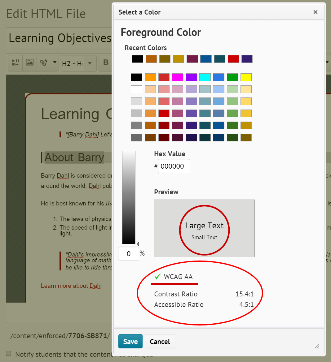
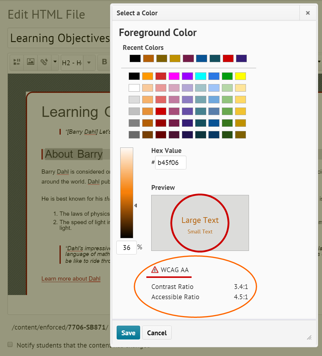
There is a built-in color checker in the HTML editor used in the Brightspace platform. Select the text that you would like to check, and then click on the Text Font Color icon in the editor.
As you click on different font colors, the Contrast Ratio numbers will change to indicate the amount of contrast between the font color (foreground color) and the background color. In addition to calculating the contrast ratio numbers, the color checker will also indicate whether the color choices conform to the Web Content Accessibility Guidelines (WCAG).
There are three possible outcomes with regard as to whether the WCAG standards are met:
Green check mark, indicating that AA WCAG standards are met with a minimum ratio of 4.5:1.
Caution symbol, indicating that it is close to, but below the 4.5:1 minimum ratio.
Red circle with white X, indicating poor contrast.
The graphic at the right indicates an acceptable contrast level of 15.4:1, which is achieved with black text on a light gray background. There are two additional graphics at the bottom of this post indicating the other two possible outcomes for meeting WCAG guidelines. Click any graphic to enlarge.
Table Formatting
HTML tables were designed for tabular data, but they have been and still are occasionally used for structure and layout of web pages. These days CSS (Cascading Style Sheets) has replaced the need for table layouts, but you will still occasionally run across them or even need to use one now and again. Tables aren’t terrible in terms of accessibility as long as they maintain a proper reading order.1
Create Data Tables with Column Headers
Designating column and/or row headers in a table is essential to screen reader users understanding how information is laid out. Screen readers usually have a keyboard command that will inform the user what the column and/or row header is for the data cell their cursor is in, making it easier to navigate and understand the tabular data. Even still, tabular data can be daunting to a screen reader user. So it is best to keep tables small if possible. Consider breaking large tables into smaller ones. But always include column and/or row headers on all tables except layout tables.1
Karen Sorensen and the team at Portland Community College created this video to explain how to add table headers in the Brightspace platform.
Use Accessible Templates for the Content Pages You Create
D2L has developed and shared HTML template packages in an effort to make it easier for course instructors to create accessible, professional looking HTML content files. The templates use a cascading style sheet (CSS) to format the content in HTML files. The accessibility features are built into the CSS file, allowing the content developer to concentrate on adding text, images, and other course resources without concern for proper formatting, which the template code takes care of for you.
Brightspace itself is built with responsive design in mind. This is what allows the platform to work equally well on computer monitors, mid-size screens such as iPads and small screen such as phones. However, IF the content that you put into Brightspace is NOT responsive, then you’ve undone all the good work that was done for you. These templates are also built to be responsive, so by using the templates you are ensuring a better experience for the student or other viewer of your online course materials.
You can download a treasure trove of free templates at the Brightspace Community. These templates are freely offered and can be used as you see fit. They come in a Zip file that needs to be:
downloaded to your computer, then
uploaded into the Manage Files section of the Brightspace Learning Environment, then
unzipped into a files folder, and then
enabled for use throughout the course in Content Settings
NOTE: full instructions for doing this are provided by D2L at the link above.
View a 2020 Fusion Presentation recording
In the D2L Community you’ll find a YouTube video of a good presentation about using the templates:
This presentation includes insights from a D2L Courseware Developer and two customers; one from Higher Ed and one from K-12.
Here are a couple screenshots from my own Brightspace course shell showing two of the template files included in version 3.0.
In the next post, we’ll consider some accessibility tips and tricks for Word documents, including specific ideas for those who use Word docs as content pages in Brightspace.
Much of the content in this series of posts comes from WAMOE, the Web Accessibility MOOC for Online Educators; co-created by Karen Sorensen of Portland Community College and Barry Dahl of D2L.
Improving the accessibility of online course content in post #7 of the series. #A11Y
In the first half of this series of blog posts, we looked at online course accessibility concerns for simple and complex images, video captions, and a general introduction about web course accessibility and why this is an important topic. In this post I’ll focus on making HTML content pages more accessible to students with disabilities, particularly for those students using assistive technology such as a screen reader.
There’s a lot to cover regarding HTML pages, so we’ll break it into parts. This time we’ll look at four simple improvements that you can make right away to your existing online courses.
One: Check your Use of Page Headings in Course Content
Properly formatted page headings are very important to structure and readability of your course content. Formatting your text as big and bold does not result in proper headings. You need to use the HTML headings coding for proper formatting, which is usually available with a simple click of the mouse. Hierarchy of the headings is also crucial. They need to be in the correct order to make sense to students using a screen reader. Headings are an important way of navigating through the content with a screen reader – think about skimming and skipping through the content. Headings also chunk out your content which also makes it easier for sighted students to read.
Heading 1 is like the title of a book and there is just one Heading 1 per page. Heading 2s are like chapter titles. Heading 3s are sub-sections of those chapters, and so on. The heading hierarchy also resembles an outline’s hierarchy if that metaphor works better for you. See the graphic above for a visual display of a possible heading order.
Note: While descending in heading levels, DO NOT skip a level.
Two: Know When to Use Ordered and Unordered Lists
Oftentimes a list is not a list. What? If you haven’t properly formatted a list of items, it might look like a list to the sighted student, but it won’t be identified as a list to the unsighted student.
The formatting elements that are part of the html code, such as lists, headings, and links, are read aloud to screen reader users, so the content is understood in context. They will be told that the next piece of content is a list, and they will also be told whether the list is ordered or unordered.
Unordered lists should be used when there is no order of sequence or importance. Ordered lists suggest a progression or sequence. As with headings, lists should be used correctly and for the right purposes. Unordered and ordered lists should always contain list items. Lists should not be used for decorative purposes such as indenting solely for layout purposes.
My favorite teams include: (this is an unordered list)
Denver Broncos
Minnesota Twins
Minnesota Vikings
San Diego Padres
My top four favorite teams are: (this is an ordered list)
San Diego Padres
Denver Broncos
Minnesota Vikings
Minnesota Twins
Three: Create Good Links to Additional Content
General guidelines for links:
Avoid using “click here” or similar non-descriptive link text. Everyone knows you have to click on or otherwise activate a link. Instead, use descriptive link text that tells the user the destination of the link. Where will they be taken if they activate the link?
If multiple links on a single page include the same link text, all those links should point to the same destination.
Screen readers say “link” before reading the link. For example: a text link of “link to discussions” would be read as “Link link to discussions.”
Users of screen readers will often tab from link to link, which is a form of content skimming. Do your links make sense when not in the context of the surrounding content?
Using the link URL as the link text is generally not a good idea from an a11y viewpoint. A particularly nasty URL (numbers, underscores, dashes, etc.) can be very confusing when listening to a screen reader. It’s also not helpful to a sighted person skimming the page
Which of these links do you prefer? Don’t be confused. They go to the same place.
Check out this W3 Schools tutorial for more info about text linking,
Any flashing/blinking content (especially content in red) can cause seizures in people with photosensitive epilepsy as well as other photosensitive seizure disorders, so it should be limited and used only when necessary. Web pages that do contain flashing content, should limit the flashing to no more than three flashes per second and not use fully saturated reds in the content. If you do have content that flashes/blinks more than three times per second, freeze the blinking content momentarily so it falls below the three times per second limit. If you have a web video with a scene involving very bright lightning flashes (or other scenes with flashes), edit the video so the lightning doesn’t flash more than three times in any one second period.2
In the next post, we’ll consider some additional HTML page accessibility elements, including those that are specifically related to making content pages in the Brightspace platform.
In post #5 in this series, I showed you some techniques to help you find videos with good captions that you are allowed (legally speaking) to use in your online courses. Of course I realize that you might want to make your own videos to ensure that your course content is explained in the manner that you prefer, and to put your own personal stamp on the course materials.
Let’s take a look at the several different techniques that you might employ to create a good set of captions for a video. I’m not going to cover all the different ways to make a video, but you likely already have your own software and techniques, or you can easily learn them as you begin to experiment with video creation.
On-screen video captions are created from text transcript files with time codes identifying when that phrase is to appear on screen. If you prefer to start from scratch, you can create your own caption files using any word processing platform or almost any text editing tool. If you would rather let someone else do the initial drafting, I recommend you use a video platform such as YouTubeTM or a similar video platform that has tools to make for relatively easy work to include good captioning in your video.
Captioning in YouTube
If you have a GoogleTM account (almost everyone does), you also have a YouTube account. You already have one if you use any of the various Google tools. If you don’t have a Google account, creating one is free and easy. After logging in to your account, go to the YouTube Video Manager. Here you will find many different options related to your video. Alternatively, if you are viewing your own video, you should also see a series of icons just below the video frame, including a CC icon, as shown below.
After clicking the icon, you will be at the Manage subtitles and closed captions page. On the right-hand side, you’ll see a blue bar that says Add new subtitles or CC. This is where you could upload your own transcript or subtitles file. Alternatively, you can click the green button besides the language of the currently published captions, which might be the automatically-generated captions, unless you have previously edited the captions.
Editing the captions is quite easy; and you are able to make changes to the captions text as well as the timing of when each caption starts and stops.
Creating a Transcript
Some students will benefit by having a transcript of the captions. One way to get a transcript is to download the captions file from YouTube and turn it into a transcript. You’ll find the download option in the “Actions” drop-down menu while editing the caption text and timing.
A technique that I often use is to create a transcript file simultaneously as I am recording the video. I do this by using a speech-to-text tool while I am making the recording. There are several free tools that do a fairly good job of converting your speech into text on the fly. Google Docs works fairly well. My preferred method lately has been to use the speech-to-text converter on my mobile phone (it’s an Android, YMMV). It does a great job of parsing through my speech and creating the text file. I can then take that text file and make any final edits prior to publishing the transcript.
There are many techniques for creating captions and transcripts. For the Web Accessibility MOOC for Online Educators (WAMOE), Karen Sorensen created the video shown below to explain how she creates captions in YouTube.
In the next post, we’ll consider some of the important accessibility elements for HTML content pages in your online courses.
This is post #5 in a series of twelve posts intended to help you improve the accessibility of your online courses.
The use of videos in online education has been steadily growing for the past two decades. As soon as video creation, editing, and sharing became easier and available to all; the usage rates of videos in online courses increased exponentially. To learn more about the use of video in education, I recommend this National Library of Medicine article: Effective Educational Videos: Principles and Guidelines for Maximizing Student Learning from Video Content.
From step-by-step screencasts, to video interviews, to artistic or historical pieces, and even the talking head lectures; videos can be an effective way of developing skills or expanding students’ knowledge.
I’m hoping that you’ll agree that there’s a problem with the captions in the image above. Some of you might think the captions are very accurate. Hard to say for sure.
A Video is More Than Just a Video
If you provide an educational video to your students, there’s a good chance that one or more of them will not be able to see or hear the content of the video and audio. This is an accessibility problem that must be addressed. Video captions and audio transcripts play an important role in providing access to students with disabilities. In this post I’ll concentrate on finding educational videos with good captions that you can use in your online courses.
Possibly your organization has purchased access to one or more of the many video libraries that might have relevant content for the subject you teach. If being sold to an academic audience, these publishing companies *almost always* have captions applied to the videos. If they don’t then your org shouldn’t be paying for them in the first place.
Much more common is for faculty and course designers to look for videos in the publicly available sites such as YouTube and their competitors. If you find a video on one of those sites that you’d like to include in your course, there are two main questions that you need to answer:
Do you the right to use the video, based on local copyright laws and/or the video license?
Is the video properly captioned?
A good strategy to proactively search for videos with these qualities, rather than trying to first find a good video and then see if it has the qualities listed above.
Finding Videos That are Free to Use
There are several different approaches you might take to find videos that are approved for use (or not restricted from such use) in your online courses. Some of the most commonly used techniques for finding these videos include:
Ask a Librarian
Librarians are typically highly skilled at finding learning resources that can be legally used in education. There is also a great chance that the library subscribes to one or more video libraries specifically for this purpose.
Search the entire web
Much has changed in the past year or two regarding searching for free-to-use videos. The current version of the Creative Commons search tool no longer searches for videos at all. Google used to have a better video search option than it does today, having removed the licensing filter from the video search tool.
I haven’t found an aggregating search tool ( one that searches multiple sites) for Creative Commons or Public Domain videos. The old Creative Commons search is still available, but no longer maintained.
Search for reusable videos on the individual video services
YouTube: when searching the YouTube site, you can turn on the filter that searches for Creative Commons licensed videos. When creators upload their videos to YouTube there are only two licensing options: 1) Standard YouTube license, and 2) Creative Commons – Attribution.
Therefore, any video on this site that has a Creative Commons license can be reused with attribution to the video owner.
With the standard YouTube license, the video owner has retained all rights to the video, except for the rights granted to YouTube by the video owner. In other words, they are not free to use by others without permission (even though many people do so).
Vimeo: probably the second-most active video site on the web, Vimeo also has filters that let you search for videos that are free-to-use.
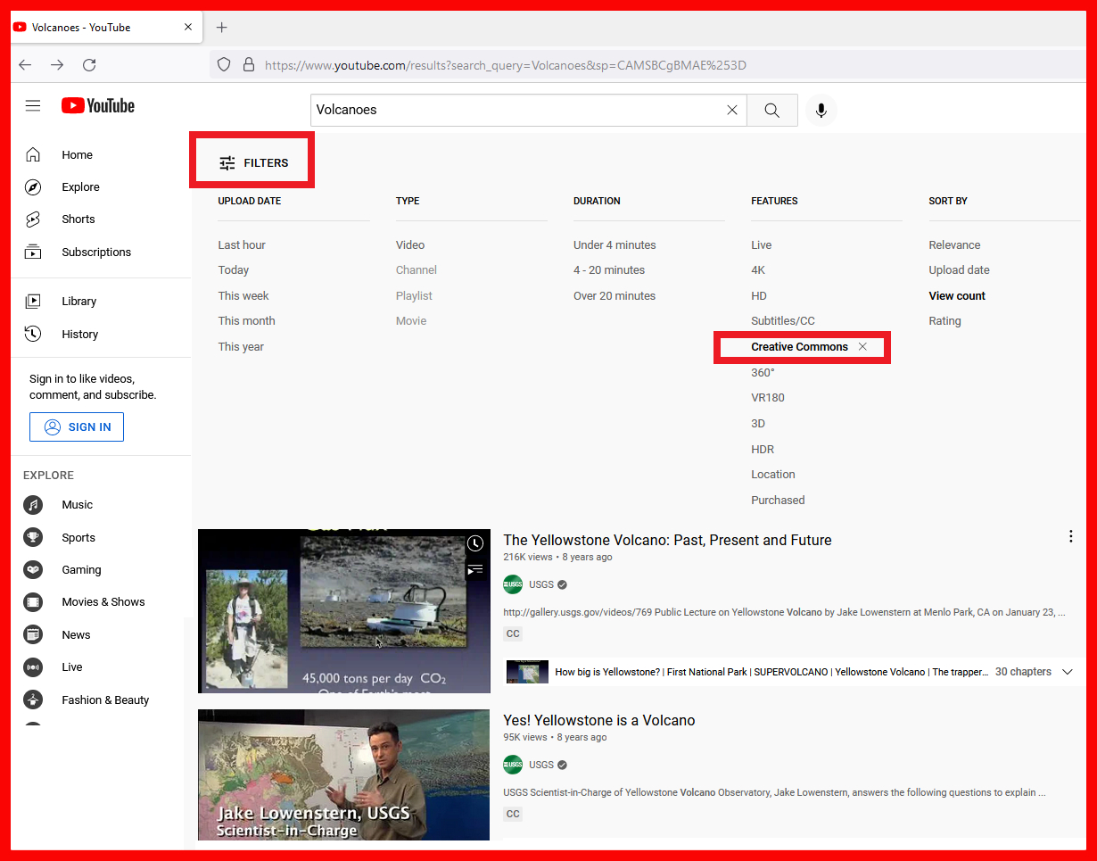
For example, if I search for Volcano, I get 18.4K results. If I turn on the CC-BY filter (Creative Commons Attribution license, free to sue if giving credit to the video creator) I then get 442 videos to choose from.
One down side to Vimeo is that there is NOT a filter to help you look for videos that have edited (usually improved) captions. Also, Vimeo does not have automatic captioning like YouTube, so you may have a harder time finding videos you can use that also have good captions.
Searching with the YouTube Filters
When you search in YouTube, the default is to return all videos with both types of licensing. This is where the Filters come into play. Most relevant to our purposes (so far) is the filter for Creative Commons licensing, which is a signal that we can use the video.
Creative Commons filter applied to YouTube search results
In the image above we see the search results looking for Creative commons videos on the topic of volcanoes. This indicates that the video owner has given permission for the video to be used as long as attribution is given to the owner – a video credit if you will. YouTube recently stopped identifying the number of search results found. This is unfortunate since it gives a good indication of how many videos for your search topic are NOT licensed as Creative Commons.
The most common licenses that allow reuse without asking for permission are a) Public Domain and b) the various Creative Commons licenses. At the present time there is not a great search option for finding videos in the Public Domain, except for some of the other video platforms that include that option. Although possibly relevant for educational use, the concept of using anything based on the defense of Fair Use is beyond the scope of this post, so I’m going to hope that you can find content that is already licensed to allow for your use in an online course.
However, finding content that you can use is only part of the battle. Now you need to ensure that your found content has the necessary features for accessibility.
What are Video Captions?
Captions are an on-screen text version of audio dialogue and other sounds in a video. More than just the spoken words, captions should also identify who is speaking when it’s not otherwise evident, and provide a sense of other sounds such as street noises, background chatter, laughter, music, or other relevant sound effects. Captions and can be added to a recorded video, or provided to live videos in real time. For the captions to make sense within the context of the video, they should be synchronized with the visual content of the video.
The original purpose of captioning was to assist hearing impaired people, but they can also be useful in many different situations. For example, captions can be read when the audio can’t be heard for a variety of reasons, such as too much noise in the surrounding area, or due to the need to keep quiet (no audio playing) such as in a hospital or in a library when headphones aren’t available. Captions can also help when learning a second language.
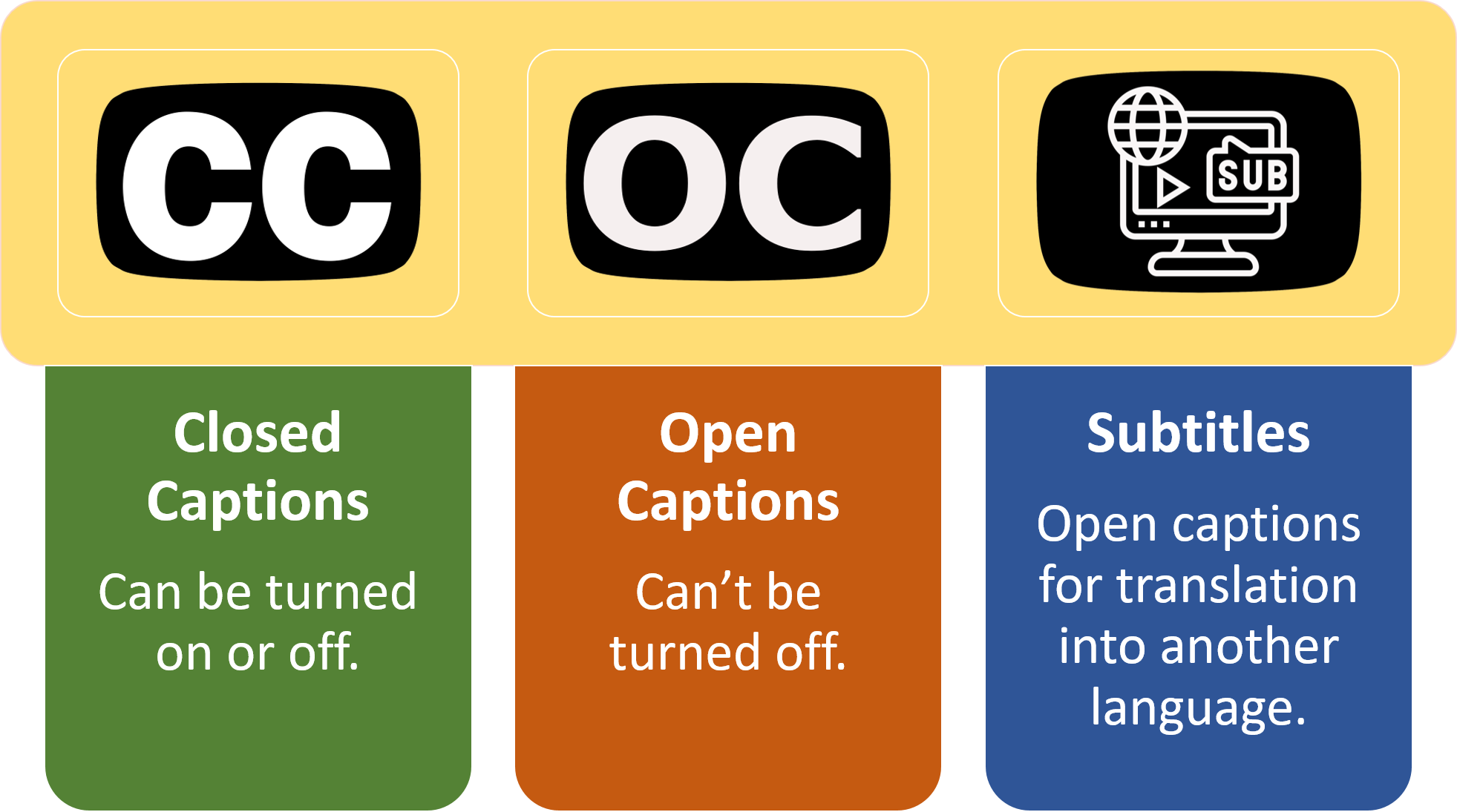
Captions can be either closed or open. Closed captions can be turned on or off, whereas open captions are always visible on screen.
Are Subtitles and Captions Interchangeable Terms?
If you’ve ever watched a foreign-language film, then odds are good that you’ve used subtitles. The main purpose of subtitles is to translate the video dialogue into one or more other languages so that the video can reach wider audiences. Subtitles typically assume the viewer can hear the audio and therefore do not contain the background sounds or notifications for speaker changes.
The terminology can be a bit confusing, especially as you travel around the world. In North America, the terms captions and subtitles are not typically used interchangeably. In most of the other parts of the world, they are. In North America, it’s probably best to think of subtitles as language translators and captions for increasing access.
Searching for Videos with Good Captions
Once again, your Librarian can be an invaluable asset in finding captioned videos. If, however, you want to go it alone, here are a few tips.
For the past ten years or so, all videos uploaded to YouTube are automatically captioned via voice recognition software as long as there are spoken words in the video. Therefore, all YouTube videos with spoken words have captions, unless the video owner deleted the captions. However, the voice-to-text captions are often very inaccurate; sometimes in an embarrassing manner.
The trick is to use the available search filters when looking for a YouTube video. Turn on the “Subtitles/CC” filter and the only videos that will be listed are those with captions that are not the automatically generated captions. I like to say that the search results are those videos where the captions have been “touched,” which is the term I use to indicate that either:
The automatic captions have been edited, or
A captions file has been uploaded by the content owner to replace the auto-caps
Typically, but not always, either of the two actions above should result in captions that are much more accurate than the automatic captions. However, it is always a good practice to review the video with the captions turned on to ensure that they are helpful and not inaccurate. The short video below shows how to use these filters in YouTube.
Looking for videos without words?
No words, no captions. Typically our concern with video captions is for the student with no or low hearing. However, if the video doesn’t contain any words, then those students are not missing anything. However again, we still can’t forget about the student with no or low vision.
Maybe you find a great video that shows exactly what you want students to learn. However, it is more of a designer video and includes no words at all. How will the unsighted student learn what you want them to from this video? You will need to supply some sort of narrative about what is happening in the video.
Here are a couple sites where you might be able to find beautiful videos that are free-to-use that are either silent or with background music only.
Pixabay: I frequently use Pixabay for finding free-to-use photos, illustrations, and other still images. However, they also have free videos on their site. This is more of a collection of stock footage videos, so you won’t always find something useful for education purposes, but you might.
Maybe you just want a beautiful video to spark a conversation in the discussion forum, or something similar. If you’re teaching about anything that’s out in nature, there’s a good chance you’ll find some videos here. Most of the videos are under one minute in length.
There’s lots of video out there, here are a few more
Chance are good that I haven’t mentioned your own favorite site for educational videos. Here’s a short list of possible sites. NOTE: I cannot and do not vouch for the captioning that happens or doesn’t happen on these sites. It’s sort of the Wild Wild West, so be careful out there.
Lastly, here is a graphic that summarizes the search filter possibilities in You Tube.
Step1: enter search terms in YouTube, Step 2: Open the search filters list, Step 3: Click on the filters for Subtitles/CC AND Creative Commons. Optional filters for video recency, video length, and sort order of results.
This is post #4 in a series of twelve posts intended to help you improve the accessibility of your online courses.
In the previous post I tried to explain the basics about Alt Text for images used in online courses. However, some online course content may be far more complicated to describe, and thus require the instructor to provide much more alternative information than can be handled through normal Alt Text methods.
Complex Image Types
The following items represent the most common types of complex images used in online learning:
Numerical charts, graphs, and scatter plots
Flow charts
Organizational charts
Diagrams and illustrations
Infographics or similar text-heavy graphics such as word clouds
Maps
Cartoons and comics
Photos with a great deal of visual information that is important to the learning process
Starting with the Obvious
The “table” shown below is not a table at all. It’s an image of a table. A screen capture or whatever you want to call it. It’s a .jpg, not readable by assistive technology.
This flat image is illustrative of how difficult it would be to describe all this information.
You would not be able to include much information at all in the Alt Text attribute to describe this information. It is recommended that you not write a book (or even a paragraph) in the Alt Text attribute. One or two sentences probably is not going to cut it for a complicated graphic like this.
So, the obvious point here is to NOT take an otherwise difficult-to-read piece of learning content and make it even more difficult by turning it into a flat image that cannot be read by a screen reader.
However, imagine that the table above is not an image, but a properly constructed data table with headers and formatting that allows a screen reader user to tab through the information contained therein. Even then it would be a difficult task to understand all the info contained within.
More Examples to Consider
How about this infographic (shortened for space but still illustrative)? The text in this infographic is not machine readable, and many infographics have an enormous amount of text.
The real infographic is 3 times this long
Or how about this Org Chart?
Lots of information in the organizational chart
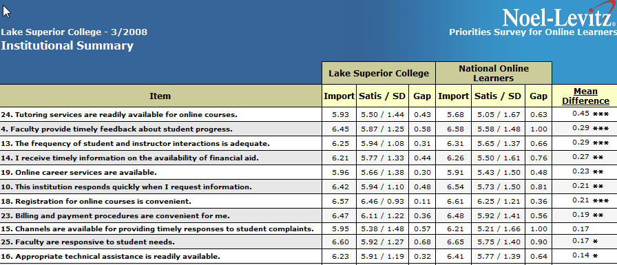
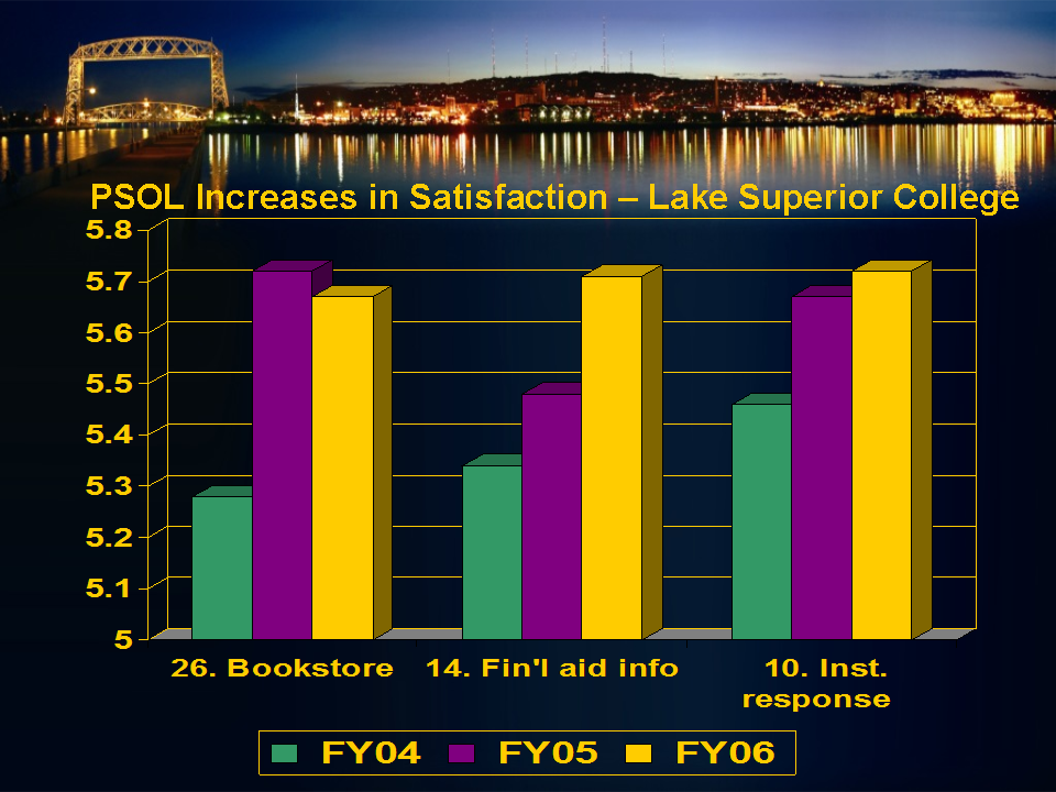
How about this column chart of student survey data?
Only 9 columns in this chart, but lots of information to explain.
Long Descriptions for Complex Images
In each example above, how you would go about describing this information to a student who cannot see the images? You can use some of the strategies described previously to write longer descriptions:
Long Descriptions, using the HTML <img> longdesc Attribute, can be provided on a separate webpage and be as long as you choose
Describing the image in the surrounding paragraph text also allows you to say as much as you like about the image
Image captions can be longer than Alt Text, but not super long
Or you can convert the image information into a more accessible format, such as adding a data table adjacent to the column chart or a turning a diagram into a tactile graphic.
Data Tables as Alternative Text for Charts
A properly formed data table is the best way to provide access to the data contained in an image of a chart, such as the column chart above. In a later post we’ll look at how to make an accessible data table.
The data in the table is real text, so it’s very accessible and provides an excellent alternate description for the chart image. Depending on the publishing platform, a data table might also offer the ability to sort and manipulate the data, so presenting the data in this way would definitely benefit all students.
Here is the data table for the column chart above
Survey Item
FY04
FY05
FY06
Online bookstore service
5.28
5.71
5.67
Online info for financial aid
5.32
5.48
5.71
Institutional responsiveness
5.45
5.67
5.72
Priorities Survey for Online Learners for Lake Huron College. Student satisfaction ratings on a 7-point scale.
Before you decide on a Data Table
Consider the context and the learning goal. Is a data table needed? In other words, are the specific data figures and details an important part of the learning? Consider the following image that might be used in a tax class for an Accounting major:
IRS chart: Gross Collections by Type of Tax, Fiscal Years 2009-2018
How important are the details above. Is the exact amount of total tax collected in 2012 an important number? Almost certainly not (so says the former accounting instructor). So what is important? Of course it depends on the intent of the instructor, but possibly:
how much the total tax collected has grown over the 9 years
and yet business income tax collections are essentially flat over the same span
How income taxes on individuals in 2018 are approximately 8 times larger than the taxes collected on business income
or maybe how the difference in 2009 was 5 times and then it grew to 8 times by 2018
How “Other” taxes are 5 times larger than business income taxes – and what are those other taxes?
In other words, often times the gist of the information is really what you want the students to know. If your instruction is based around knowing the gist of the information in the chart, then you can provide a summary of the important things to know. However, if the goal is for students to be able to summarize the data in plain language – then they will need to be able to analyze the details in order to come up with their own summary or gist – thus the need for a data table.
Making that Infographic Accessible
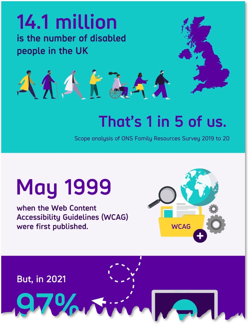
You can find the infographic shown earlier in this post at the Big Hack website. What you’ll find there are two things I want to highlight.
The text version of the information is provided directly below the infographic. That is their alternative text for the image, and they even included links to the sources of the information. This is very good.
They also provide embed code “If you would like to share this infographic on your website.” This is where the accessibility typically falls apart.
This next section is important: “Please include a copy of the plain text version alongside the image for anyone who cannot access the information. Alternatively, you can signpost to this page saying there is a plain text version available.”
If you don’t do either of these things (and many people don’t), then you’ve just divorced the inaccessible infographic from the accessible alternative text. Don’t do that!
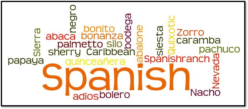
Before Wordle We Had Wordle
Here we have the lovely (jk) word cloud. Let’s assume that you teach some sort of language class and the exercise at hand is to look at how words from one language seep into usage in another language. Such as the words in the image above that are Spanish words commonly used by English-speakers. In other words, let’s assume that there is some educational value in the words in this cloud. That very often is not the case with word clouds.
This graphic was made years ago at Wordle dot net, which appears now to be in the deadpool, likely thanks to the NYT Wordle site. The original Wordle word cloud generator appears to be alive in an alternate site called EdWordle.
Word clouds are very strange from a web accessibility perspective. To make the word cloud, you enter words in plain text (usually copy and paste or provide a URL) and have the generator make a flat image that contains the same words in text that is not machine readable. Then you need to provide Alt Text so that the words in the image are available to assistive technology. To do that, you need to provide the original plain text words. That’s a strange workflow.
If your word cloud has no significant educational value, then you can safely mark it as a decorative image. If you have a word cloud that you really want to use in your course content or elsewhere, go ahead and do so, But, and this is a big but, you must provide all the important words and possibly the reasons that make those words important in plain text on the same page or as a Long Description page.
Last Example – An Attempt at Humor?
Here’s a poster I put together many moons ago.
This may be the best accounting joke ever told.
I don’t think that the regular Alt Text attribute (about 125 characters) will work for this image. Assuming that you don’t decide to mark it as decorative, how would you provide Alt Text for this image?