

Post #8 in Accessibility series. Improving the accessibility of Online Course Content pages. #A11Y
As a D2L Brightspace user, I’ll concentrate on some of the features built into the Brightspace platform that can be used to enhance the accessibility of your online courses. In this post, we’ll look at three of those features.
Color Contrast Checker
There is a built-in color checker in the HTML editor used in the Brightspace platform. Select the text that you would like to check, and then click on the Text Font Color icon in the editor.
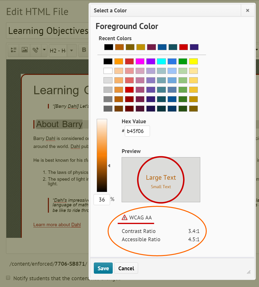
As you click on different font colors, the Contrast Ratio numbers will change to indicate the amount of contrast between the font color (foreground color) and the background color. In addition to calculating the contrast ratio numbers, the color checker will also indicate whether the color choices conform to the Web Content Accessibility Guidelines (WCAG).
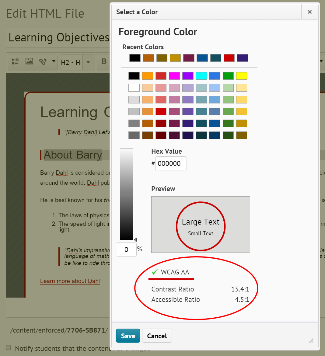
There are three possible outcomes with regard as to whether the WCAG standards are met:
- Green check mark, indicating that AA WCAG standards are met with a minimum ratio of 4.5:1.
- Caution symbol, indicating that it is close to, but below the 4.5:1 minimum ratio.
- Red circle with white X, indicating poor contrast.
The graphic at the right indicates an acceptable contrast level of 15.4:1, which is achieved with black text on a light gray background. There are two additional graphics at the bottom of this post indicating the other two possible outcomes for meeting WCAG guidelines. Click any graphic to enlarge.
Table Formatting
HTML tables were designed for tabular data, but they have been and still are occasionally used for structure and layout of web pages. These days CSS (Cascading Style Sheets) has replaced the need for table layouts, but you will still occasionally run across them or even need to use one now and again. Tables aren’t terrible in terms of accessibility as long as they maintain a proper reading order.1
Create Data Tables with Column Headers
Designating column and/or row headers in a table is essential to screen reader users understanding how information is laid out. Screen readers usually have a keyboard command that will inform the user what the column and/or row header is for the data cell their cursor is in, making it easier to navigate and understand the tabular data. Even still, tabular data can be daunting to a screen reader user. So it is best to keep tables small if possible. Consider breaking large tables into smaller ones. But always include column and/or row headers on all tables except layout tables.1
Karen Sorensen and the team at Portland Community College created this video to explain how to add table headers in the Brightspace platform.
Use Accessible Templates for the Content Pages You Create
D2L has developed and shared HTML template packages in an effort to make it easier for course instructors to create accessible, professional looking HTML content files. The templates use a cascading style sheet (CSS) to format the content in HTML files. The accessibility features are built into the CSS file, allowing the content developer to concentrate on adding text, images, and other course resources without concern for proper formatting, which the template code takes care of for you.
Brightspace itself is built with responsive design in mind. This is what allows the platform to work equally well on computer monitors, mid-size screens such as iPads and small screen such as phones. However, IF the content that you put into Brightspace is NOT responsive, then you’ve undone all the good work that was done for you. These templates are also built to be responsive, so by using the templates you are ensuring a better experience for the student or other viewer of your online course materials.
You can download a treasure trove of free templates at the Brightspace Community. These templates are freely offered and can be used as you see fit. They come in a Zip file that needs to be:
- downloaded to your computer, then
- uploaded into the Manage Files section of the Brightspace Learning Environment, then
- unzipped into a files folder, and then
- enabled for use throughout the course in Content Settings
- NOTE: full instructions for doing this are provided by D2L at the link above.
View a 2020 Fusion Presentation recording
In the D2L Community you’ll find a YouTube video of a good presentation about using the templates:
Creating Customizable and Inspirational Learning Materials Using HTML Templates
This presentation includes insights from a D2L Courseware Developer and two customers; one from Higher Ed and one from K-12.
Here are a couple screenshots from my own Brightspace course shell showing two of the template files included in version 3.0.


In the next post, we’ll consider some accessibility tips and tricks for Word documents, including specific ideas for those who use Word docs as content pages in Brightspace.
Much of the content in this series of posts comes from WAMOE, the Web Accessibility MOOC for Online Educators; co-created by Karen Sorensen of Portland Community College and Barry Dahl of D2L.
1 Written by Karen Sorensen for WAMOE module 4-1.
Below: Additional screenshots of D2L Color Checker
Directory to posts in this series:
- Improving Accessibility of Online Courses – the why
- What do Educators Need to Know about VPATs?
- Alt Text for Simple Images in Online Courses
- Complex Images – Going Beyond Simple Alt Text
- Finding Videos with Good Captions
- Captioning Videos for Your Online Courses
- Improving the Accessibility of your HTML Content Pages – Part 1
- Improving the #A11y of Your HTML Content Pages – Part 2
- Making Word Documents Accessible for Online Learning
- Making PowerPoint Files Accessible for Online Learning
- Using Web-based Tools in Online Learning – #A11y
- Six More Tips for Making Online Courses Accessible
Filed under: accessibility |

Leave a comment