Making PowerPoint Files Accessible for Online Learning

Blog Post #10 in Series of Accessibility Tips for Online Teaching. Only two more coming!

Microsoft® PowerPoint® presentation graphics program and similar programs are frequently used for creating course content in all levels of education. If those PowerPoint® slide decks are placed online as part of an online course, it is important for those decks to be accessible to student using assistive technology.

Using PowerPoint Slides in Online Courses

First, an opinion regarding slide shows as course content. From an accessibility perspective, the same content provided in an HTML page or a series of pages would usually be more accessible than a slide deck. Whenever possible, provide online course content as a web page. If that is not possible, then providing a slide deck that is created in an accessible manner is one alternative to consider.

There is a complicating factor when designing a slide deck for students using a screen reader. There are different views that the student can utilize when screen reading through a PowerPoint file. The Normal View in PowerPoint presentation manager is most often used by sighted users, and can be used with a screen reader. However, many unsighted users will switch to the Outline View which provides a text-only reading of the slide contents. It is a good practice to design your content in Outline View to ensure that all important information is available to students using a screen reader with this view. When the Outline contains all necessary information, you can switch to Normal View to add additional elements for sighted users.

Accessibility Tips and Techniques When Using PowerPoint

In this post, we’ll consider the following items:

  • Proper use of layout templates
  • Proper use of slide titles
  • Reading order of multiple elements in a slide
  • Similarities to accessibility in Microsoft® Word®
  • Using the built-in Accessibility Checker

Proper use of layout templates
 

The home tab in PowerPoint includes the New Slide drop-down where you can select from many different slide layouts

Since 2000, PowerPoint presentation graphics program has included a selection of highly-accessible slide layouts. By utilizing these layout options, you will have an easier time making your slide content accessible to students using assistive technology such as screen reader platforms. Every time that you add an additional element to a slide that isn’t contained in one of the built-in placeholders, you run the risk of that piece of content being inaccessible.

When adding a new slide, choose the slide layout that contains the type of content elements that will best fit your needs. You can also change the current layout of any existing slide by selecting your choice from the Home > Layout menu.

You can resize and move the slide elements without negatively impacting the accessibility of the slide. However, let’s look at an example of what happens when you add new elements to a slide.

Let’s assume that you choose a new slide from the graphic shown above, and that you choose the “Title Only” layout. You enter a title for the slide. You then select Insert > Pictures and you add a photograph to the slide. You then select Insert > Text Box and write a caption for the photograph. You size and position both the photo and the caption so it looks good to the sighted student. However, to the unsighted student using a screen reader in Outline View, they will hear the slide title, and that’s all. Neither the added text box nor the inserted photo will appear in the Outline View of the slide.

Proper use of Slide Titles

Until you design a slide deck with accessibility in mind, you probably haven’t given much thought to your slide titles, at least not much thought to their importance to a student using a screen reader.

Each slide should have a descriptive title that helps organize the content for the unsighted user. Including a slide that does not have a title leaves a blank space in the Outline View, which is confusing to someone using a screen reader. Even if you don’t want to have the slide title appear on the slide for sighted viewers, you should still populate the title placeholder, and then hide the title behind another object, or by moving it off-screen (it’s still part of the slide, just not in the viewing area), or by using the Hide feature found in Home > Arrange > Selection Pane.

The titles should also be unique. Repeating the same title text would be similar to having two chapters in a book with the same title. Having unique titles enables people to navigate quickly, especially when attempting to return to an earlier slide for review.

PowerPoint outline view showing one slide without a title at all and two slides that have the same title. Both should be avoided.

The example above indicates what it would be like for an unsighted student to use a screen reader while tabbing through the titles of slides. Slide 2 has no title at all, and slides 4 and 5 have the same title.

Reading order of multiple elements in a slide

This one is often overlooked by people creating PowerPoint slides, unless they have an eye on accessibility. Previously we looked at the importance of using the built-in slide layouts with accessible placeholders for titles, text, pictures, etc. Now let’s look at what difference it makes when those multiple slide elements are being read to a student by a screen reader. In the accompanying graphic, there are five elements on the slide: 1) title, 2) left text placeholder, 3) left content, 4) right text placeholder, 5) right content.

Most of the time, you would want a screen reading program to read those five elements in the order listed above. The newer versions of PowerPoint presentation graphics program are better at determining a logical reading order for the elements on a slide, but older versions are trickier. The graphic below shows the order that the elements would be read by a screen reader. Notice that the Home > Arrange> Selection Panel will list the slide elements from the bottom up. In this example, the elements would be read to the student in the proper order.

Screenshot showing the Powepoint Selection panel that indicates the reading order of the items on the slide

However, in older versions of PowerPoint, the elements would be read in the order in which you entered them into the boxes. For example, the reading order could be as shown below by the black boxes:

Selection pane showing a strange order for the items on the page to be read by a screen reader. In this example, the slide title would be read last.

In this case, you would need to drag and drop the elements in the Selection pane to put them in the proper reading order, again with the first item at the bottom of the list and the last item at the top. This is counter-intuitive to many people.

Similarities to accessibility in Microsoft Word

In the previous post, we looked at various accessibility features in Microsoft Word. There are many similarities between Word and PowerPoint programs when it comes to accessibility for students using assistive technology. Please refer back to the previous post for information about the following items:

  • Where to add Alt Text
  • Formatting of tables

Using the Built-in Accessibility Checker

Starting with PowerPoint 2010 presentation graphics program, there is a built-in tool that checks your document for accessibility problems. The Accessibility Checker makes it much easier to identify and repair accessibility issues. To use the tool, select File > Info > Check for Issues > Check Accessibility.

Accessibility checker window indicating two errors; 1) Missing alt text for an image and 2) missing slide title on slide 2. Also two tips are displayed.

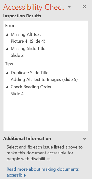
An example report is shown on the right. Click on any of the reported items to get help with improving the accessibility of the various slides.

Categories of items found by Accessibility Checker

Errors: Content that makes the document impossible or very difficult to read and understand for people using assistive technology. Common errors in PowerPoint documents include:

  • Slides without titles
  • Missing alt text for non-text objects
  • Proper table header formatting

Warnings: Content that will likely (but not always) make the document difficult to understand for people using assistive technology. Common warnings include:

  • Table structure (split or merged cells, nested tables, or completely blank rows or columns)
  • Hyperlink text that is not meaningful or descriptive

Tips: Content that should be understood with assistive technology, but could be better organized to improve the experience. Common tips include:

  • If there is a video, it will alert you to check for closed captions
  • Slide titles should be unique (not repeated)
  • The reading order of various slide components is in logical order

One more thing. If you’re designing slides for accessibility, you’ll need to make the file available to students so that they can use the file with their screen reading platform. If you put the slides online, there is a good chance that many of the accessibility features will be lost. Make the file available for download for those who need to use a screen reader.

In the next post, we’ll conclude this series with six more tips to improve the accessibility of your online course content.

Much of the content in this series of posts comes from WAMOE, the Web Accessibility MOOC for Online Educators; co-created by Karen Sorensen of Portland Community College and Barry Dahl of D2L.

Microsoft and PowerPoint are either registered trademarks or trademarks of Microsoft Corporation in the United States and/or other countries.

Directory to posts in this series:

  1. Improving Accessibility of Online Courses – the why
  2. What do Educators Need to Know about VPATs?
  3. Alt Text for Simple Images in Online Courses
  4. Complex Images – Going Beyond Simple Alt Text
  5. Finding Videos with Good Captions
  6. Captioning Videos for Your Online Courses
  7. Improving the Accessibility of your HTML Content Pages – Part 1
  8. Improving the #A11y of Your HTML Content Pages – Part 2
  9. Making Word Documents Accessible for Online Learning
  10. Making PowerPoint Files Accessible for Online Learning
  11. Using Web-based Tools in Online Learning – #A11y
  12. Six More Tips for Making Online Courses Accessible

Making Word Documents Accessible for Online Learning

Ninth post in Accessibility series. Improving the accessibility of Online Course Content pages. #A11Y

Many educators use one or more programs contained in Microsoft® Office when creating course content or other instructional materials for online courses. In this post we’ll focus on a few tips and techniques for making accessible content using Microsoft® Word, although similar concepts would apply to other word processing programs.

Using Word Documents in Online Courses

First, an opinion regarding word processing documents. From an accessibility perspective, the same content provided in an HTML page would usually be more accessible than a word processing document. If at all possible, provide online course content as a web page. If that is not possible, then providing a Word document that is created in an accessible manner is one alternative to consider.

Accessibility Tips and Techniques When Using Word

In this post, we’ll consider the following items:

  • Proper use of Word Headings
  • Where to add Alt Text
  • Formatting of tables
  • Using the built-in Accessibility Checker

Proper Use of Word Headings

Proper uses of the heading structure help people with low or no vision to understand how a document is organized. Screen reader users can jump from one heading to the next, which makes page navigation more efficient than if there are no headings.  The concept of using proper headings in a Word document is the same as previously covered when creating HTML pages.

You should always use the built-in Styles to identify Heading 1, Heading 2, etc. in a Word document. Simply changing the font size or making it bold does not make it a heading.

The default style in Word uses light blue heading colors. These headings do not have the necessary color contrast for accessibility. Make sure to change those headings to a darker color. You can also edit the default template so that all new documents also have the preferred darker headings.

Where to add Alt Text in Word

If you’ve learned how to add Alt Text to an image in an HTML page, you need to follow a slightly different procedure when adding Alt Text to a Word document. Alt Text should be added to the Description field in the Format Picture box, and the Title field should be left blank. Below is an example of a photo in a Word document on the left and the Format Picture box on the right.

User-added image

Additionally, when using Word, you should also add Alt Text to the following:

  • Tables
  • Charts
  • WordArt
  • Shapes
  • SmartArt graphics

Here is an example using SmartArt. This is the feedback cycle for learning. Start at the top with Understanding & Meaning, and proceed clockwise. As with the photo above, Alt Text goes in the Description field.

User-added image

Formatting of Tables

There are significant issues for screen reader users when trying to learn from a data table in Word. You are able to add column headers in Word, but it does not support the concept of row headers, which can be problematic for screen reader users.

Steps to follow when designating the header row depend somewhat on the version of Word that you are utilizing. The screenshot below is taken from Word 2016.

  1. Put your cursor in the top row of your data table.User-added image
  2. The Table Tools tab will display.
  3. Click on the Design tab under the Table tab.
  4. In the Table Style Options group, select the Header Row check box.

Next, change to the Table Layout tab, as shown below, and click the button “Repeat as Header Rows,” which provides structure for navigating the table if it appears on multiple pages.

User-added image

Perform one final test on your table before sending it out into the wild. Screen reading software will read tables from left to right, top to bottom, one cell at a time with no repeats. The order in which the cells will be read can be thrown off if your table contains split cells or merged cells.

Always test the reading order of Word tables by placing your cursor in the first cell of the table, then continuously pressing the Tab key to navigate through the table. Pay attention to the order in which the cursor moves through the cells, as this will be the reading order that a screen reader would follow.

Using the Built-in Accessibility Checker

Starting with Word 2010, there is a built-in tool that checks your document for accessibility problems. The Accessibility Checker makes it much easier to identify and repair accessibility issues. To use the tool, select File > Info > Check for Issues > Check Accessibility.User-added image

Categories of items found by Accessibility Checker

Errors: Content that makes the document impossible or very difficult to read and understand for people using assistive technology. Common errors in Word documents include:

  • No headings applied and no Table of Contents used
  • Missing Alt Text for non-text objects
  • Proper table header formatting

Warnings: Content that will likely (but not always) make the document difficult to understand for people using assistive technology. Common warnings include:

  • Table structure (split or merged cells, nested tables, or completely blank rows or columns)
  • Hyperlink text that is not meaningful or descriptive
  • Repeated blank characters

Tips: Content that should be understood with assistive technology, but could be better organized to improve the experience. Common tips include:

  • If there is a video, it will alert you to check for closed captions
  • If an image has a watermark, it might be misunderstood
  • Headings follow in a logical order, no levels are skipped

In the next post, we’ll consider the accessibility features of creating content in Microsoft PowerPoint®.

Much of the content in this series of posts comes from WAMOE, the Web Accessibility MOOC for Online Educators; co-created by Karen Sorensen of Portland Community College and Barry Dahl of D2L.

Microsoft and PowerPoint are either registered trademarks or trademarks of Microsoft Corporation in the United States and/or other countries.

Directory to posts in this series:

  1. Improving Accessibility of Online Courses – the why
  2. What do Educators Need to Know about VPATs?
  3. Alt Text for Simple Images in Online Courses
  4. Complex Images – Going Beyond Simple Alt Text
  5. Finding Videos with Good Captions
  6. Captioning Videos for Your Online Courses
  7. Improving the Accessibility of your HTML Content Pages – Part 1
  8. Improving the #A11y of Your HTML Content Pages – Part 2
  9. Making Word Documents Accessible for Online Learning
  10. Making PowerPoint Files Accessible for Online Learning
  11. Using Web-based Tools in Online Learning – #A11y
  12. Six More Tips for Making Online Courses Accessible

Improving the #A11y of Your HTML Content Pages – Part 2

Post #8 in Accessibility series. Improving the accessibility of Online Course Content pages. #A11Y

As a D2L Brightspace user, I’ll concentrate on some of the features built into the Brightspace platform that can be used to enhance the accessibility of your online courses. In this post, we’ll look at three of those features.

Color Contrast Checker

There is a built-in color checker in the HTML editor used in the Brightspace platform. Select the text that you would like to check, and then click on the Text Font Color icon in the editor.

As you click on different font colors, the Contrast Ratio numbers will change to indicate the amount of contrast between the font color (foreground color) and the background color. In addition to calculating the contrast ratio numbers, the color checker will also indicate whether the color choices conform to the Web Content Accessibility Guidelines (WCAG).

The color contrast checker shows a green check mark indicating that the contrast between background and font color is sufficient.

There are three possible outcomes with regard as to whether the WCAG standards are met:

  • Green check mark, indicating that AA WCAG standards are met with a minimum ratio of 4.5:1.
  • Caution symbol, indicating that it is close to, but below the 4.5:1 minimum ratio.
  • Red circle with white X, indicating poor contrast.

The graphic at the right indicates an acceptable contrast level of 15.4:1, which is achieved with black text on a light gray background. There are two additional graphics at the bottom of this post indicating the other two possible outcomes for meeting WCAG guidelines. Click any graphic to enlarge.

Table Formatting

HTML tables were designed for tabular data, but they have been and still are occasionally used for structure and layout of web pages. These days CSS (Cascading Style Sheets) has replaced the need for table layouts, but you will still occasionally run across them or even need to use one now and again. Tables aren’t terrible in terms of accessibility as long as they maintain a proper reading order.1

Create Data Tables with Column Headers

Designating column and/or row headers in a table is essential to screen reader users understanding how information is laid out. Screen readers usually have a keyboard command that will inform the user what the column and/or row header is for the data cell their cursor is in, making it easier to navigate and understand the tabular data. Even still, tabular data can be daunting to a screen reader user. So it is best to keep tables small if possible. Consider breaking large tables into smaller ones. But always include column and/or row headers on all tables except layout tables.1

Karen Sorensen and the team at Portland Community College created this video to explain how to add table headers in the Brightspace platform.

Use Accessible Templates for the Content Pages You Create

D2L has developed and shared HTML template packages in an effort to make it easier for course instructors to create accessible, professional looking HTML content files. The templates use a cascading style sheet (CSS) to format the content in HTML files. The accessibility features are built into the CSS file, allowing the content developer to concentrate on adding text, images, and other course resources without concern for proper formatting, which the template code takes care of for you.

Brightspace itself is built with responsive design in mind. This is what allows the platform to work equally well on computer monitors, mid-size screens such as iPads and small screen such as phones. However, IF the content that you put into Brightspace is NOT responsive, then you’ve undone all the good work that was done for you. These templates are also built to be responsive, so by using the templates you are ensuring a better experience for the student or other viewer of your online course materials.

You can download a treasure trove of free templates at the Brightspace Community.  These templates are freely offered and can be used as you see fit. They come in a Zip file that needs to be:

  • downloaded to your computer, then
  • uploaded into the Manage Files section of the Brightspace Learning Environment, then
  • unzipped into a files folder, and then
  • enabled for use throughout the course in Content Settings
  • NOTE: full instructions for doing this are provided by D2L at the link above.

View a 2020 Fusion Presentation recording

In the D2L Community you’ll find a YouTube video of a good presentation about using the templates:

Creating Customizable and Inspirational Learning Materials Using HTML Templates

This presentation includes insights from a D2L Courseware Developer and two customers; one from Higher Ed and one from K-12.

Here are a couple screenshots from my own Brightspace course shell showing two of the template files included in version 3.0.

From version 3.0 of the template package, this is 03, the "Meet your Instructor" page.
The Accordian template, number 09, allows you to add accordian elements to any of your course content pages with a simple copy and paste.

In the next post, we’ll consider some accessibility tips and tricks for Word documents, including specific ideas for those who use Word docs as content pages in Brightspace.

Much of the content in this series of posts comes from WAMOE, the Web Accessibility MOOC for Online Educators; co-created by Karen Sorensen of Portland Community College and Barry Dahl of D2L.

Written by Karen Sorensen for WAMOE module 4-1.

Below: Additional screenshots of D2L Color Checker 

The color contrast checker shows a caution sign since the contrast between background and font color is insufficient, falling short of the standard of 4.5 to 1..
The color contrast checker shows a red X indicating that the contrast between background and font color is way below the standard needed.

Directory to posts in this series:

  1. Improving Accessibility of Online Courses – the why
  2. What do Educators Need to Know about VPATs?
  3. Alt Text for Simple Images in Online Courses
  4. Complex Images – Going Beyond Simple Alt Text
  5. Finding Videos with Good Captions
  6. Captioning Videos for Your Online Courses
  7. Improving the Accessibility of your HTML Content Pages – Part 1
  8. Improving the #A11y of Your HTML Content Pages – Part 2
  9. Making Word Documents Accessible for Online Learning
  10. Making PowerPoint Files Accessible for Online Learning
  11. Using Web-based Tools in Online Learning – #A11y
  12. Six More Tips for Making Online Courses Accessible

Improving the Accessibility of your HTML Content Pages – Part 1

Improving the accessibility of online course content in post #7 of the series. #A11Y

In the first half of this series of blog posts, we looked at online course accessibility concerns for simple and complex images, video captions, and a general introduction about web course accessibility and why this is an important topic. In this post I’ll focus on making HTML content pages more accessible to students with disabilities, particularly for those students using assistive technology such as a screen reader.

There’s a lot to cover regarding HTML pages, so we’ll break it into parts. This time we’ll look at four simple improvements that you can make right away to your existing online courses.

One: Check your Use of Page Headings in Course Content

Indicates a proper ordering of Page Headings. Never skip over a heading number.

Properly formatted page headings are very important to structure and readability of your course content. Formatting your text as big and bold does not result in proper headings. You need to use the HTML headings coding for proper formatting, which is usually available with a simple click of the mouse. Hierarchy of the headings is also crucial. They need to be in the correct order to make sense to students using a screen reader. Headings are an important way of navigating through the content with a screen reader – think about skimming and skipping through the content. Headings also chunk out your content which also makes it easier for sighted students to read.

Heading 1 is like the title of a book and there is just one Heading 1 per page. Heading 2s are like chapter titles. Heading 3s are sub-sections of those chapters, and so on. The heading hierarchy also resembles an outline’s hierarchy if that metaphor works better for you. See the graphic above for a visual display of a possible heading order.

Note: While descending in heading levels, DO NOT skip a level.

Two: Know When to Use Ordered and Unordered Lists

Oftentimes a list is not a list. What? If you haven’t properly formatted a list of items, it might look like a list to the sighted student, but it won’t be identified as a list to the unsighted student.

The formatting elements that are part of the html code, such as lists, headings, and links, are read aloud to screen reader users, so the content is understood in context. They will be told that the next piece of content is a list, and they will also be told whether the list is ordered or unordered.

Unordered lists should be used when there is no order of sequence or importance. Ordered lists suggest a progression or sequence. As with headings, lists should be used correctly and for the right purposes. Unordered and ordered lists should always contain list items. Lists should not be used for decorative purposes such as indenting solely for layout purposes.

My favorite teams include: (this is an unordered list)

  • Denver Broncos
  • Minnesota Twins
  • Minnesota Vikings
  • San Diego Padres

My top four favorite teams are: (this is an ordered list)

  1. San Diego Padres
  2. Denver Broncos
  3. Minnesota Vikings
  4. Minnesota Twins

Three: Create Good Links to Additional Content

General guidelines for links:

  • Avoid using “click here” or similar non-descriptive link text. Everyone knows you have to click on or otherwise activate a link. Instead, use descriptive link text that tells the user the destination of the link. Where will they be taken if they activate the link?
  • If multiple links on a single page include the same link text, all those links should point to the same destination.
  • Screen readers say “link” before reading the link. For example: a text link of “link to discussions” would be read as “Link link to discussions.”
  • Users of screen readers will often tab from link to link, which is a form of content skimming. Do your links make sense when not in the context of the surrounding content?
  • Using the link URL as the link text is generally not a good idea from an a11y viewpoint. A particularly nasty URL (numbers, underscores, dashes, etc.) can be very confusing when listening to a screen reader. It’s also not helpful to a sighted person skimming the page
  • Which of these links do you prefer? Don’t be confused. They go to the same place.

Four: Avoid Flashing or Blinking Content

Any flashing/blinking content (especially content in red) can cause seizures in people with photosensitive epilepsy as well as other photosensitive seizure disorders, so it should be limited and used only when necessary. Web pages that do contain flashing content, should limit the flashing to no more than three flashes per second and not use fully saturated reds in the content. If you do have content that flashes/blinks more than three times per second, freeze the blinking content momentarily so it falls below the three times per second limit. If you have a web video with a scene involving very bright lightning flashes (or other scenes with flashes), edit the video so the lightning doesn’t flash more than three times in any one second period.2

In the next post, we’ll consider some additional HTML page accessibility elements, including those that are specifically related to making content pages in the Brightspace platform.

Directory to posts in this series:

  1. Improving Accessibility of Online Courses – the why
  2. What do Educators Need to Know about VPATs?
  3. Alt Text for Simple Images in Online Courses
  4. Complex Images – Going Beyond Simple Alt Text
  5. Finding Videos with Good Captions
  6. Captioning Videos for Your Online Courses
  7. Improving the Accessibility of your HTML Content Pages – Part 1
  8. Improving the #A11y of Your HTML Content Pages – Part 2
  9. Making Word Documents Accessible for Online Learning
  10. Making PowerPoint Files Accessible for Online Learning
  11. Using Web-based Tools in Online Learning – #A11y
  12. Six More Tips for Making Online Courses Accessible