Complex Images – Going Beyond Simple Alt Text

This is post #4 in a series of twelve posts intended to help you improve the accessibility of your online courses.

In the previous post I tried to explain the basics about Alt Text for images used in online courses. However, some online course content may be far more complicated to describe, and thus require the instructor to provide much more alternative information than can be handled through normal Alt Text methods.

Complex Image Types

The following items represent the most common types of complex images used in online learning:

  • Numerical charts, graphs, and scatter plots
  • Flow charts
  • Organizational charts
  • Diagrams and illustrations
  • Infographics or similar text-heavy graphics such as word clouds
  • Maps
  • Cartoons and comics
  • Photos with a great deal of visual information that is important to the learning process

Starting with the Obvious

The “table” shown below is not a table at all. It’s an image of a table. A screen capture or whatever you want to call it. It’s a .jpg, not readable by assistive technology.

This flat image is illustrative of how difficult it would be to describe all this information.

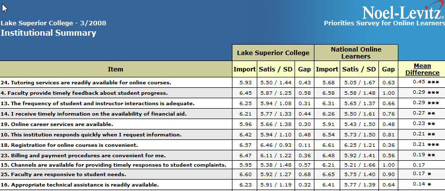
You would not be able to include much information at all in the Alt Text attribute to describe this information. It is recommended that you not write a book (or even a paragraph) in the Alt Text attribute. One or two sentences probably is not going to cut it for a complicated graphic like this.

So, the obvious point here is to NOT take an otherwise difficult-to-read piece of learning content and make it even more difficult by turning it into a flat image that cannot be read by a screen reader.

However, imagine that the table above is not an image, but a properly constructed data table with headers and formatting that allows a screen reader user to tab through the information contained therein. Even then it would be a difficult task to understand all the info contained within.

More Examples to Consider

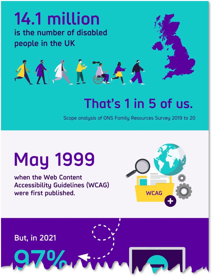
How about this infographic (shortened for space but still illustrative)? The text in this infographic is not machine readable, and many infographics have an enormous amount of text.

The real infographic is 3 times this long

Or how about this Org Chart?

Lots of information in the organizational chart

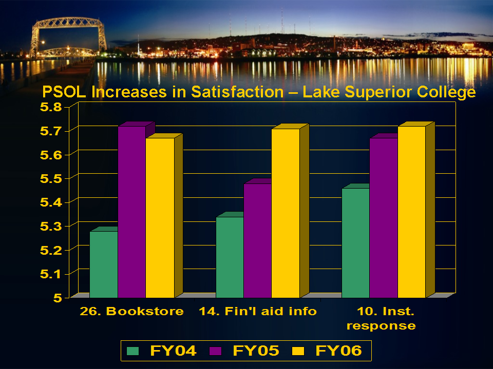
How about this column chart of student survey data?

Only 9 columns in this chart, but lots of information to explain.

Long Descriptions for Complex Images

In each example above, how you would go about describing this information to a student who cannot see the images? You can use some of the strategies described previously to write longer descriptions:

  • Long Descriptions, using the HTML <img> longdesc Attribute, can be provided on a separate webpage and be as long as you choose
  • Describing the image in the surrounding paragraph text also allows you to say as much as you like about the image
  • Image captions can be longer than Alt Text, but not super long

Or you can convert the image information into a more accessible format, such as adding a data table adjacent to the column chart or a turning a diagram into a tactile graphic.

Data Tables as Alternative Text for Charts

A properly formed data table is the best way to provide access to the data contained in an image of a chart, such as the column chart above. In a later post we’ll look at how to make an accessible data table.

The data in the table is real text, so it’s very accessible and provides an excellent alternate description for the chart image. Depending on the publishing platform, a data table might also offer the ability to sort and manipulate the data, so presenting the data in this way would definitely benefit all students.

Here is the data table for the column chart above

Survey ItemFY04FY05FY06
Online bookstore service5.285.715.67
Online info for financial aid5.325.485.71
Institutional responsiveness5.455.675.72
Priorities Survey for Online Learners for Lake Huron College. Student satisfaction ratings on a 7-point scale.

Before you decide on a Data Table

Consider the context and the learning goal. Is a data table needed? In other words, are the specific data figures and details an important part of the learning? Consider the following image that might be used in a tax class for an Accounting major:

Tax chart from IRS website, described in the surrounding text
IRS chart: Gross Collections by Type of Tax, Fiscal Years 2009-2018

How important are the details above. Is the exact amount of total tax collected in 2012 an important number? Almost certainly not (so says the former accounting instructor). So what is important? Of course it depends on the intent of the instructor, but possibly:

  • how much the total tax collected has grown over the 9 years
    • and yet business income tax collections are essentially flat over the same span
  • How income taxes on individuals in 2018 are approximately 8 times larger than the taxes collected on business income
    • or maybe how the difference in 2009 was 5 times and then it grew to 8 times by 2018
  • How “Other” taxes are 5 times larger than business income taxes – and what are those other taxes?

In other words, often times the gist of the information is really what you want the students to know. If your instruction is based around knowing the gist of the information in the chart, then you can provide a summary of the important things to know. However, if the goal is for students to be able to summarize the data in plain language – then they will need to be able to analyze the details in order to come up with their own summary or gist – thus the need for a data table.

Making that Infographic Accessible

You can find the infographic shown earlier in this post at the Big Hack website. What you’ll find there are two things I want to highlight.

  1. The text version of the information is provided directly below the infographic. That is their alternative text for the image, and they even included links to the sources of the information. This is very good.
  2. They also provide embed code “If you would like to share this infographic on your website.” This is where the accessibility typically falls apart.
    • This next section is important: “Please include a copy of the plain text version alongside the image for anyone who cannot access the information. Alternatively, you can signpost to this page saying there is a plain text version available.”
    • If you don’t do either of these things (and many people don’t), then you’ve just divorced the inaccessible infographic from the accessible alternative text. Don’t do that!

Before Wordle We Had Wordle

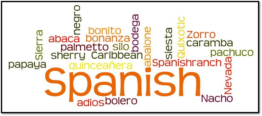
Here we have the lovely (jk) word cloud. Let’s assume that you teach some sort of language class and the exercise at hand is to look at how words from one language seep into usage in another language. Such as the words in the image above that are Spanish words commonly used by English-speakers. In other words, let’s assume that there is some educational value in the words in this cloud. That very often is not the case with word clouds.

This graphic was made years ago at Wordle dot net, which appears now to be in the deadpool, likely thanks to the NYT Wordle site. The original Wordle word cloud generator appears to be alive in an alternate site called EdWordle.

Word clouds are very strange from a web accessibility perspective. To make the word cloud, you enter words in plain text (usually copy and paste or provide a URL) and have the generator make a flat image that contains the same words in text that is not machine readable. Then you need to provide Alt Text so that the words in the image are available to assistive technology. To do that, you need to provide the original plain text words. That’s a strange workflow.

If your word cloud has no significant educational value, then you can safely mark it as a decorative image. If you have a word cloud that you really want to use in your course content or elsewhere, go ahead and do so, But, and this is a big but, you must provide all the important words and possibly the reasons that make those words important in plain text on the same page or as a Long Description page.

Last Example – An Attempt at Humor?

Here’s a poster I put together many moons ago.

This may be the best accounting joke ever told.

I don’t think that the regular Alt Text attribute (about 125 characters) will work for this image. Assuming that you don’t decide to mark it as decorative, how would you provide Alt Text for this image?

Directory to posts in this series:

  1. Improving Accessibility of Online Courses – the why
  2. What do Educators Need to Know about VPATs?
  3. Alt Text for Simple Images in Online Courses
  4. Complex Images – Going Beyond Simple Alt Text
  5. Finding Videos with Good Captions
  6. Captioning Videos for Your Online Courses
  7. Improving the Accessibility of your HTML Content Pages – Part 1
  8. Improving the #A11y of Your HTML Content Pages – Part 2
  9. Making Word Documents Accessible for Online Learning
  10. Making PowerPoint Files Accessible for Online Learning
  11. Using Web-based Tools in Online Learning – #A11y
  12. Six More Tips for Making Online Courses Accessible

Alt Text for Simple Images in Online Courses

This is post #3 in a series of twelve posts intended to help you improve the accessibility of your online courses.

What are Alternate Text Descriptions?

For a sighted person, images related to the learning content can be very informative and valuable. A picture’s worth a thousand words and all that stuff. So let’s assume that you have included several images in your online course; such as images in content pages, in discussion posts, possibly in a quiz question, and so on. Let’s also assume that one or more of your students has a visual impairment and uses a screen reader (assistive technology) while accessing your course.

Visual impairments make it difficult or even impossible for the student to see the image and comprehend the information you are trying to convey with that image. That’s where Alt Text come into play. For this series of blog posts, I will refer to Alt Text as shorthand for Alternate Text, also often called Alternative Text.

Alt Text is the text-only information that is associated with an image for the purpose of providing information that is equivalent to the image itself.

Informative Images or Decorative Images?

Informative Image Example

Many images used in online courses are informational in nature; which means that the image conveys information that is part of the learning activity in which it is used. For example, in an Entomology course on Bees and Beekeeping, this image of a honeybee pollinating a sunflower is most likely an important image for the learning process, or at least it could be. Students who can see the image won’t necessarily know what is educational about it, but they might. In other words, the educational purpose might be obvious to someone who can view the image, but it definitely won’t be obvious to someone who can’t view the image. This is where Alt Text comes in. More on that in a minute.

The important part of learning from this image might not be obvious to your learners.

Decorative Image Example

A decorative image in an online course is one that does not convey important educational content. They are often used for layout purposes, humor, or just what could be called eye-candy. For example, assume that you want to have a little fun with your students so you post a News item stating that today is National Hoagie Day, and post a photo as well (maybe to spark a debate as to whether it should be called a hoagie, a sub, a hero, or a grinder). A student who is unable to view the image is at no educational disadvantage by missing this image. There is no need to explain the image to the student either. Your text announcing that it is Hoagie Day is sufficient for them to see your humorous side.

No need for Alt Text since this is decorative

Alt Text for Informative Images

For a student who cannot view the image, the informational content must be explained in real text in some way that is accessible to the student using assistive technology, typically screen reading software. That readable text can be in the form of:

  • An alt text description that is part of the HTML code, but is not viewable on the screen.
  • A descriptive caption for the image that can be read by sighted people and read by screen readers.
  • A description of the educational content conveyed by the image in the surrounding paragraph text.

For the honeybee image shown above, we would need to know the context in order to determine what should be included in the alt text or caption or surrounding paragraph. Possibly the point has to do with the fact that sunflowers are self-pollenating, which might beg the question of whether the honeybee is adding any value by visiting the flower. Let’s make that assumption for this example. Here is one possibility for the alt text:

Even though sunflowers are self-pollenating, research shows honeybee activity can improve crop yields.

Is that the best Alt Text for this image? We don’t know, that’s a trick question. The answer of what is the best alt text is contingent on the point of the learning conveyed by the image. That’s where your professional judgment comes in.

However, there is information in the Alt Text above that is not obvious in the photo. The info about bees improving crop yields is a piece of learning that would be important to all your learners. If it is only contained in the Alt Text, then sighted users could be at a disadvantage. More on this at the end of the post.

Effective practices for writing Alt Text

Some basic guidelines:

  • Do not include “picture of” or “image of” in the Alt Text.
    • A screen reader will automatically announce that it has come to an image. So an Alt Text “Image of a honeybee” would be read aloud by a screen reader as “image, Image of a honeybee”.
  • Using correct grammar can enhance the experience for screen reader users:
    • Capitalize the first letter.
    • End whole sentences with a period.
  • As a general rule of thumb, keep Alt Text prose to about 100-200 characters or less.
    • Some people say that there is a limit of 125 characters or similar, but my research shows this not to be true. It might have been true once upon a time, but browsers and screen readers change all the time.
    • Look at using other methods for longer descriptions of an image.
  • Many images contain embedded text which is not readable by assistive technology.
    • If any embedded words are important, make sure they are included in the Alt Text.
  • As illustrated with the honeybee, don’t include unique information in the Alt Text.
    • Don’t put sighted users at a disadvantage by putting important information ONLY in the Alt Text.
  • Don’t repeat yourself.
    • If the information is already available in the content within the proper context, repeating the same information in the Alt Text is a waste of the learner’s time.

You’re not trying to improve SEO in your online course

SEO is shorthand for Search Engine Optimization. You can visit many websites where they school you on writing good alt text for an image on a website. They tell you to be as descriptive as possible. Refer back to the bee and sunflower photo. Here are two possible Alt Text outcomes:

  1. Honeybee sitting on the outer edge of the disc florets of a bright yellow sunflower.
  2. Even though sunflowers are self-pollenating, research shows honeybee activity can improve crop yields.

Number 1 is very descriptive of the image. But what is the educational value of that text?

Number 2 conveys information that is relevant to the course and may be made more memorable including the image.

For webpage optimization, many web developers will fill the Alt Text for images with a bunch of keywords since search engines typically scan image Alt Text. Keep in mind that an online course has a very different purpose, so please don’t dump a bunch of keywords into your Alt Text.

Alt Text for Decorative Images

Images that are for decorative purposes do not need to be explained to students with no or low vision. To properly communicate the fact that the image is decorative, you need to use null alt text so that assistive technology can inform the student that the image is not important to the educational content of the topic.

Code example of null alt text: <img src=”yummy-hoagie.jpg” alt=””>

It is important to understand that null alt text (as shown above in the code with alt=””) is not the same as no alt text, where the alt text attribute is completely missing. If null alt text is entered, assistive technology will ignore the image altogether, which is a good thing since it conveys nothing important. However, if the alt text attribute is completely missing, then the student will be told that there is an image, and they will wonder what they are missing since there is no alt text to explain the importance of the image.

How do you determine whether an image is informative or decorative? I see many examples of where authors error on the side of caution. To me, the side of caution is to write Alt Text for an image just to be on the safe side in case it’s not merely decorative. I might be one who pulls the decorative lever more often than others. If it doesn’t add to the learning at hand, or if the info conveyed by the image is available in plain text somewhere else in the materials, then I’m likely to call it decorative.

Why not add Alt Text anyway even if the image is decorative?

Students using assistive technology such as a screen reading platform already have hurdles to clear in order to learn the course content. Anything that saves them time or doesn’t muddy the waters is a good thing for them. Adding Alt Text to a decorative image may even be a signal to the unsighted learner that there is something more important about the image than intended by the instructor. If you decide the image is decorative, then use the null Alt Text attribute and let the learner skip over the image entirely. It’s the learner-friendly thing to do.

Should decorative images even be a thing in online courses?

I’ve had several people ask whether it’s a good practice to just completely leave out decorative images. One school of thought is that if the images don’t enhance the learning in any significant way, then why have them at all?

Short answer: Decorative images are fine

Longer answer: Decorative images are fine as long as they are marked properly with the Null Alt Text attribute. Some of the main reasons for using decorative images include:

  • adding an icon next to a text link to draw attention or increase the clickable area;
  • the image is already described by surrounding text;
  • adding borders, spacers, and corners for visual styling;
  • because you want to include some “eye-candy”.
    • just because an unsighted student can’t appreciate the eye candy isn’t a reason to take it away from all learners (remember, there’s no enhancement of the learning with these images).

What about Captions?

Some software platforms make it easy to enter an image caption, while others require you to add the caption coding directly into the HTML for the page. If you know how to do this, it is an effective practice to put this information in the caption for the benefit of all students. If you enter the text in a caption, then do not repeat it in the alt text attribute.

If your authoring platform doesn’t provide an easy way to insert captions, then you might want to consider the other possible ways to provide your learners with the important info in the images.

Don’t Forget About Surrounding Text

Many experts will suggest that the best practice, and in this case I really do mean best, is to put all of the relevant information in the surrounding text. For the sunflower and honeybee photo above, that would mean that everything that is educationally important about that image should be explained in the on-page text that accompanies the image. Sighted students and those using assistive technology would all have access to the same information. If all the information is conveyed in the surrounding text, then it is appropriate to not repeat that info in the alt text, at which point the image can be treated as decorative for students using assistive technology.

Alt Text: a Useful Point-of-View, IMO

I like to think of Alt Text as if it’s living “behind the photo.” If you were viewing a physical photo album, it would be something that someone wrote on the back of the photo, or on the page behind the photo. Unless you know it’s there, you’ll never know what it says.

Of course it’s possible for a sighted student to find the Alt Text for a digital image on a webpage, but it’s not easy nor intuitive. Remember, the mouse over popup is NOT the Alt Text.

Refer back to the suggested Alt Text for the bee and sunflower. There is information in the Alt Text that is not obvious in the photo. This is a clear example, IMO, of a case where you should not use the Alt Text code attribute but should either insert a caption or put that information into the surrounding text on the page. That way the info is readable by sighted users as well as learners using assistive technology.

Even though sunflowers are self-pollenating, research shows honeybee activity can improve crop yields.

Some recommended resources for more info on Alt Text for simple images:

Directory to posts in this series:

  1. Improving Accessibility of Online Courses – the why
  2. What do Educators Need to Know about VPATs?
  3. Alt Text for Simple Images in Online Courses
  4. Complex Images – Going Beyond Simple Alt Text
  5. Finding Videos with Good Captions
  6. Captioning Videos for Your Online Courses
  7. Improving the Accessibility of your HTML Content Pages – Part 1
  8. Improving the #A11y of Your HTML Content Pages – Part 2
  9. Making Word Documents Accessible for Online Learning
  10. Making PowerPoint Files Accessible for Online Learning
  11. Using Web-based Tools in Online Learning – #A11y
  12. Six More Tips for Making Online Courses Accessible

What do Educators Need to Know about VPATs?

Post #2 in a series of twelve posts intended to help you improve the accessibility of your online courses.

This is a greatly shortened version of the full post. Check out the TL;DR version to see it all.

In this installment, we’ll take a look at a somewhat technical, and often over-looked aspect of using technology and software in education. Often-overlooked unless you are an IT professional or an employee working in a purchasing office.

Check the Accessibility Concerns of your Educational Software

What is a VPAT?

The Voluntary Product Accessibility Template (VPAT) is a tool that provides information about how well a vendor’s product or service conforms to the Section 508 Accessibility Standards. Since it is voluntary, not all companies will provide a VPAT for all of their products, but most companies that take an active interest in being inclusive with their product development will provide this information.

How to Find a VPAT

In the Web Accessibility MOOC for Online Educators (WAMOE), we asked the students (who were educators) to search for a VPAT for software or hardware that they used in their online courses. It could be something that they used themselves for content creation or similar purposes, or it could be something that they encouraged or required their students to use.

In most cases, WAMOE participants would do a web search using keywords of VPAT and the name of the tech product. This simple web search would often bear fruit very easily, with an obvious search result that would lead to the desired document. However, there were many times when the search brought back confusing results or no helpful information at all.

What if They Don’t Have a VPAT?

Unless you can be assured that the recommended technology will be accessible to all students, it is a good idea to provide an alternative assignment that can be used by those who cannot make use of the primary technology that has been assigned.

What Can You Learn from a VPAT?

The VPAT is a series of tables, each comprised of three columns. The Summary Table provides the vendor’s information related to conformance with Section 508 Standards of the United States Rehabilitation Act. Column one of the Summary Table contains eight accessibility criteria that are found in subparts B and C of the 508 Standards. Column two describes any supporting features in the product or service that helps conform to the individual criterion. Column three is for any remarks and explanations that the vendor would like to share.

VPAT Example – a web conferencing solution

The detail table for Section 1194.22 Web-based Internet information and applications includes the following (excerpting criteria a, c, and g as examples):

  • Criteria: (a) A text equivalent for every non­text element shall be provided (e.g., via “alt”, “longdesc”, or in element content).
    • Supporting Features: Supports with Exceptions
    • Remarks and explanations: The product interface itself does not have any deficiencies requiring this, and authors are urged to do so should the need arise.
  • Criteria: (c) Web pages shall be designed so that all information conveyed with color is also available without color, for example from context or markup.
    • Supporting Features: Supports
    • Remarks and explanations: All color contrasts comply with industry standard minimums.
  • Criteria: (g) Row and column headers shall be identified for data tables.
    • Supporting Features: Not Applicable
    • Remarks and explanations: The product does not contain any data tables.

Row (a) contains something that you’ll see quite frequently; the vendor saying that their product doesn’t have accessibility issues with a criterion, but content loaded by the end user just might. It’s always important to differentiate between product features and items added by the end user.

In an educational context, this boils down to the following: a) is the technology accessible to the instructor or student who needs to create educational content, and b) is the output of the technology accessible to users/viewers of said output?

You’ve Found a VPAT, Now What?

At many colleges and universities, vendor VPATs are used as a first step to verify the accessibility of the technology (both software and hardware) that will be purchased or recommended for use by students and employees. This is only a first step, because it is a wise choice to do some additional end-user testing to verify the information contained in the VPAT. For example, consider a software product that indicates in the VPAT that text included in an object created by that software is readable by assistive technology such as a screen reader. It would be a good idea to test that yourself using the screen reading technology that is normally deployed at your organization.

More info in TL;DR

Yikes, it’s Inaccessible. Now what?

Okay, so now you’ve reviewed the VPAT and completed functional testing and found the product to have accessibility barriers that cannot be accommodated. Now what? Well either the product shouldn’t be used or you have to provide students with disabilities an accessible alternative when they encounter a barrier. These accessible alternatives should be figured out well in advance of a student with a disability enrolling.

Still need more about the VPAT? Check out the longer version of this post.

Directory to posts in this series:

  1. Improving Accessibility of Online Courses – the why
  2. What do Educators Need to Know about VPATs?
  3. Alt Text for Simple Images in Online Courses
  4. Complex Images – Going Beyond Simple Alt Text
  5. Finding Videos with Good Captions
  6. Captioning Videos for Your Online Courses
  7. Improving the Accessibility of your HTML Content Pages – Part 1
  8. Improving the #A11y of Your HTML Content Pages – Part 2
  9. Making Word Documents Accessible for Online Learning
  10. Making PowerPoint Files Accessible for Online Learning
  11. Using Web-based Tools in Online Learning – #A11y
  12. Six More Tips for Making Online Courses Accessible

Improving Accessibility of Online Courses – the why

This is the first post in a series of twelve posts intended to help you improve the accessibility of your online courses.

During this series, the word accessibility is used in the context of making your online courses better for students with various disabilities. To help set the stage for this series of posts, let’s start with a couple of videos.

Keyboard image with Accessibility key replacing the Enter key

Portland Community College: To Care and Comply

Portland Community College (PCC) created this 11-minute video in 2015. PCC employees talk about their web accessibility guidelines and how supporting students with disabilities is a shared responsibility across the college. Tips and techniques that faculty and staff can use to improve their online course materials to make course components more accessible are also included. It is embedded below, or you can open it separately in YouTube.

These things jump out at me from the PCC video:

  • The intro examples of navigating online courses with assistive technology
  • The various students’ stories about their needs for accessible learning materials
  • Mission of PCC, and there is no success without access (10:30)

You can learn more about the various accessibility resources provided by PCC at their website.

University of Washington DO-IT: IT Accessibility: What Campus Leaders Have to Say

I also highly recommend a second video, this one from DO-IT (Disabilities, Opportunities, Internetworking, and Technology) at the University of Washington. DO-IT provides many excellent resources for educators and students. They also have an excellent Center for Universal Design in Education. This video highlights the importance and strategies for making Information Technology accessible on a campus-wide basis. Open DO-IT video separately.

Highlights for me in this video include:

  • Notice that the video is audio-described (AD).
  • At 1:37, Tracy Mitrano clarifies that making an accommodation was a good starting point, but only the start of the conversation about dealing with accessibility.
  • At 2:32, Pablo Molinda states that just like privacy and security, accessibility needs to be designed from the initial conception, not an afterthought.
  • At 3:58, Gerry Hanley shows that his state system requires all vendors provide equally effective access to the services provided by the vendor.

In the second post we’ll look into the importance of a VPAT and what you can learn from them. In the remaining posts we’ll focus more on the question of how to improve the accessibility of online courses. I thought it was important to start with this post dealing more with the question of why improved web accessibility is important in online learning.

The PCC video is shared with express written consent from PCC, and the University of Washington video is shared under the license of Creative Commons Attribution. The accessibility keyboard graphic is shared under Creative Commons Attribution by creator Poakpong.

Directory to posts in this series:

  1. Improving Accessibility of Online Courses – the why
  2. What do Educators Need to Know about VPATs?
  3. Alt Text for Simple Images in Online Courses
  4. Complex Images – Going Beyond Simple Alt Text
  5. Finding Videos with Good Captions
  6. Captioning Videos for Your Online Courses
  7. Improving the Accessibility of your HTML Content Pages – Part 1
  8. Improving the #A11y of Your HTML Content Pages – Part 2
  9. Making Word Documents Accessible for Online Learning
  10. Making PowerPoint Files Accessible for Online Learning
  11. Using Web-based Tools in Online Learning – #A11y
  12. Six More Tips for Making Online Courses Accessible